Objective
Another way to characterize a distribution or a sample is via a box plot (aka a box and whiskers plot). Specifically, a box plot provides a pictorial representation of the following statistics: maximum, 75th percentile, median (50th percentile), mean, 25th percentile, and minimum.
Box plots are especially useful when comparing samples and testing whether data is distributed symmetrically.
Real Statistics Data Analysis Tool
To generate a box plot, you can use the Box Plot option of the Descriptive Statistics and Normality data analysis tool found in the Real Statistics Resource Pack, as described in the following example. See also Creating Simple Boxplots in Excel for how to create the box plot manually using Excel’s charting capabilities.
Example 1: A market research company asks 30 people to evaluate three brands of tablet computers using a questionnaire. The 30 people are divided at random into 3 groups of 10 people each, where the first group evaluates Brand A, the second evaluates Brand B and the third evaluates Brand C. Figure 1 summarizes the questionnaire scores from these groups.

Figure 1 – Sample data
To generate the box plots for these three groups, press Ctrl-m and select the Descriptive Statistics and Normality data analysis tool. A dialog box will now appear as shown in Figure 4 of Descriptive Statistics Tools. Select the Box Plot option and insert A3:C13 in the Input Range. Check Headings included with the data and uncheck Use exclusive version of quartile.
The resulting chart is shown in Figure 2.

Figure 2 – Box Plot
Box Plot Output
Note too that the data analysis tool also generates a table, which may be located behind the chart. For those who are interested, this table contains the information in Figure 3, as explained further in Creating Simple Boxplots in Excel.
For each sample, the box plot consists of a rectangular box with one line extending upward and another extending downward (usually called whiskers). The box itself is divided into two parts. In particular, the meaning of each element in the box plot is described in Figure 3.
| Element | Meaning |
| Top of upper whisker | Maximum value of the sample |
| Top of box | 75th percentile of the sample |
| Line through the box | Median of the sample |
| Bottom of the box | 25th percentile of the sample |
| Bottom of the lower whisker | Minimum of the sample |
| × markers | Mean of the sample |
Figure 3 – Box Plot elements
Inclusive vs exclusive quartile
There are two versions of this table, depending on whether or not you check or uncheck the Use exclusive version of quartile field. If checked then the QUARTILE.EXC version of the 25th and 75th percentile is used (or QUARTILE_EXC for Excel 2007 users), while if this field is unchecked then the QUARTILE.INC (or equivalently the QUARTILE) version is used. See Ranking Functions in Excel for more details about the difference between these two versions.
From the box plot in Figure 2, we can see that the scores for Brand C tend to be higher than for the other brands and those for Brand B tend to be lower. We also see that the distribution of Brand A is pretty symmetric at least in the range between the 1st and 3rd quartiles, although there is some asymmetry for higher values (or potentially there is an outlier). Brands B and C look less symmetric. Because of the long upper whisker (especially with respect to the box), Brand B may have an outlier (see Outliers and Robustness for a discussion of outliers).
Another indication of symmetry is whether the × marker for the mean coincides with the median.
Alternative Representation
We can also convert the box plot to a horizontal representation of the data (as shown in Figure 4) by first deleting the markers for the means (by clicking on any of these markers and pressing the backspace key) and then clicking on the chart and selecting Insert > Charts|Bar > Stacked Bar.

Figure 4 – Horizontal Box Plot
Box Plot with Negative Data Values
When a data set has one or more negative values, the y-axis will be shifted upward by the amount of -MIN(R1). Here, R1 is the data range containing the data. Thus if R1 ranges from -10 to 20, the range in the chart will range from 0 to 30.
Example 2: Create the box plot for the data in Figure 5.9.1 where cell B11 is changed to -300 and the exclusive version of the quartile function.
The procedure is the same as for Example 1, except that this time we check the Use exclusive version of quartile option. The output is shown in Figure 5.
The key difference is that since the smallest data value is -300 (the value in cell F13), all the box plot values are shifted up by 300. This is evident by noting that the lower tail for Brand B is at 0 instead of -300 (and that cell G6 contains 0 instead of -300).
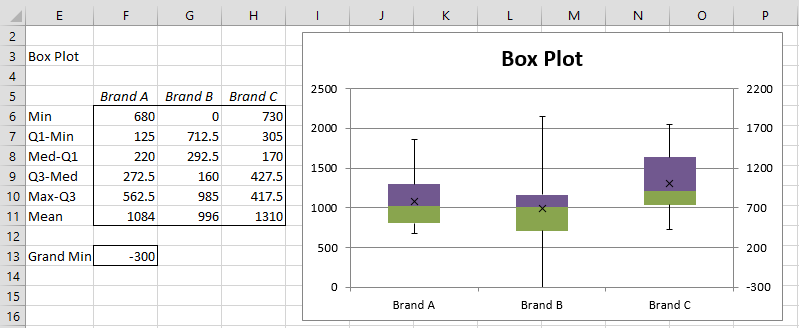
Figure 5 – Box plot for negative data
Note that two y-axes are displayed. The one on the left is based on the displacement of 300 units, while the one on the right shows the correct units.
Removing one y-axis
You can remove the y-axis on the left by following the following steps:
- Select the y-axis on the left and then right-click.
- Choose the Format Axis… option from the menu that appears.
- When the menu of options appears as shown in Figure 6, change the Label Position option from Next to Axis to None.
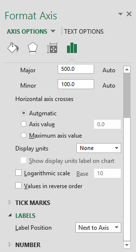
Figure 6 – Remove left y-axis
Note that if you change any of the data elements, the box chart will still be correct, although the right y-axis will not change and will still reflect the original data, and so you will need to rely on the left y-axis (you can remove the right y-axis as described above for the left y-axis).
More Information about Box Plots
See Box Plots with Outliers to see how to generate box plots in Excel which also explicitly show outliers. The following two versions are described:
- An Excel charting capability that is available for versions of Excel starting with Excel 2016
- An extended version of the Real Statistics data analysis tool described above. This tool is available even for versions of Excel prior to Excel 2016.
See Creating Simple Boxplots in Excel for how to create a box plot manually, using only Excel charting capabilities.
Links
Examples Workbook
Click here to download the Excel workbook with the examples described on this webpage.
Reference
Wikipedia (2012) Box plot
https://en.wikipedia.org/wiki/Box_plot
This does not work if Q1 is less than 0.
Hi Charles,
Thank you so much for this amazing tool. It works perfectly and saves so much time and thought. Thanks for putting it together and making it available free of charge. Hope we can always get notifications to upgrade as time goes on.
Much regards
Hello Benjamin,
Glad that you like the Real Statistics software. If you follow @Real1Statistics on twitter you will always be informed of a new release.
Charles
Hello, Charles!
Thank you very much for this amazing tool.
Do you have an issue when trying to apply a different style to a boxplot chart? For example, a black style theme? In my case the boxplot looks distorted. I can change the color manually, but theme option isn’t working for me.
Thanks much!
Hello,
Glad that you like the tool.
Are you able to make the style changes that you are interested in on a standard Excel chart (e.g. a column chart)?
While the Real Statistics boxplot chart uses some special Excel chart capabilities, in the end it is just an Excel chart. I have never tried to use the style capabilities myself, but I guess the boxplot should be amenable to some style changes but perhaps not to some others,
Charles
When moving to bar charts, you asked to remove the scatter plot of labels. I am trying to bring it back with Bar charts. But it seems Excel doesn’t handle scatter plots well with bar charts. It’s forcing my scatter chart to go on secondary axis and not working.
Have you or anyone else figured out to show (display) the mean labels (i’d also add median to it) to the horizontal layout?
Thanks
Dear Charles,
Firstly, thanks for providing this add-in.
Extremenly useful. Your efforts are much appreciated.
Regarding box plots, you state that
“There are two versions of this table, depending on whether you check or uncheck the Use exclusive version of quartile field. If checked then the QUARTILE.EXC version of the 25th and 75th percentile is used (or QUARTILE_EXC for Excel 2007 users), while if this field is unchecked then the QUARTILE (or equivalently the QUARTILE.INC) version is used.”.
For the novice, would it be worth stating how outputs might differ between these choices? I have tried creating a few plots with each using small arrays, and cannot see any difference between them (and a web search does not help). Perhaps bigger arrays may do so, which leaves me wondering about the choices.
Hi, Charles!
I generated the box plots of 3 groups of similar data (responses of 498 respondents to a particular survey item, randomly grouped into 3).
However, unlike the box plot of group I, which consists of violet and green boxes such as in your illustration above, the box plot of groups II and III consist of only a green box each.
What does it mean when a box plot consists only of a green box?
Thank you so much!
Hi Adel,
If the box is all green, then the median is equal to the 75th percentile.
Charles
Hi,
I am using Excel 2016 and I cant find the box plot chart anywhere. The Control+m isnt working for me. Nothing happens when I hit control+m. And whenever I go to the insert tab box plot isn’t an option anywhere where the charts are located.
Hi Megan,
Have you installed the Real Statistics software? Ctrl-m is used to initialize the Real Statistics software, which contains the box plot capability described on this webpage.
Excel does provide a box chart capability; see
https://support.office.com/en-us/article/create-a-box-and-whisker-chart-62f4219f-db4b-4754-aca8-4743f6190f0d
Charles
How can you add all the data points to your box plot? Kind of like putting a scatter plot of the date round the box plot?
Regards
Is it possible to add grouped box plots in Excel (MS Prof Plus 2013)?
Brant,
Yes. You can even use the approaches described on the website as long as you create the subgroups manually.
Charles
Hi Charles, I would like to ask you if it is possible to create a box plot in realstatistics, but to include 1st and 9th decile instead of minimum and maximum. When I try to do it manually, boxplots are depicting negative values even though I don´t have any in my samples. Could you please help me? Thank you very much in advance. Regards, Michaela
Michaela,
I just tried it using the Real Statistics software and it worked perfectly. I just changed the values for MIN(R1) and MAX(R1) to PERCENTILE(R1,.1) and PERCENTILE(R1,.9). I don’t see any reason why the manual approach wouldn’t work as well.
Charles
You are right, I just did something wrong. Thank you very much!!
Dear Charles,
I am trying to analyse my data for a biology project and I need all the data to be included in the boxplot, not marked as outliers, because I am looking at different cells so it is just different behaviour, not abnormalities that are reflected by the numbers I got. However, when I am using the box and whisker option in excel it creates the plot with outlier values. Is it possible to somehow include everything in the box?
Thank you in advance.
Regards,
Narina
Narina,
Yes. The Real Statistics webpage that you have been looking at shows you how to do this.
The Real Statistics software will do this for you automatically. Both the versions where the outliers are highlighted and not highlighted are supported.
Charles
Dear Charles,
Thank you very much for your reply!
Regards,
Narina
Hello Charles.
Thank you for your tool which works with Excel / Windows. Is there a version for a Excel / Mac ? There’s a “small” bug at this time : (in French)
Erreur d’execution “-2147467259 (80004005)” : La méthode “Add” de l’objet “CommandBarControls” a échoué.
I think this command doesn’t exist on Mac, but maybe there’s another one.
Thank you foryourtime, your skills and your anwers.
Best regard
Felix,
If you send me an Excel file with your data and test results, I will try to figure out why you are getting this error. The software should work with Excel in other languages than English (I use an Italian version myself).
There is a Mac version of the software. See the following:
Real Statistics Resource Pack for Mac
Charles
This is very useful for generating box and whisker plots in older versions (2010) of Excel. Thanks for putting this together, posting it, and keeping it updated. No small task.
Thank you so very much for this Charles 🙂
should I use inclusive or exclusive median when calculating the IQR?
Duncan,
There isn’t a definitive answer, but generally the exclusive version of the quartiles (not the median) is preferred.
Charles
I am having trouble getting outliers to show for me, even when I check the outliers and missing data option. I see there are fields for Outlier limit and # of outliers – do I need to populate those fields and, if so, how?
Sarah,
You just need to check the Box Plot w/ Outliers option. You don’t need to use the Outlier limit or # of Outliers fields. This boxplot will show the outliers.
The Outliers with Missing Data option is different and is explained at the following webpage
https://real-statistics.com/sampling-distributions/identifying-outliers-missing-data/
Charles
I can’t do any of the instructions. I use excel 2013.
Steven,
What problem are you having?
Charles
I use excel 2016. it has box and whisker chart but I cant change y axis scale. I need y axis to be logarithmic scale. can you help me?
One approach is to take the log of the raw data and then draw of the box and whisker chart of this transformed data.
Charles
Hi! How can I show the outliers in the boxplot?
what if the question did not give the population data? only population size, mean and standard deviation are given. how to find the min,q1,q2,q3 and max?
You can’t calculate min,q1,q2,q3 and max from population size, mean and std dev.
Charles
Hi Charles.
I have a spreadsheet which will make any number of parallel box plots automatically (well, up to 25 anyway) as you type or paste the categories and values. It doesn’t use macros. You’re welcome to it if it’s of use. Just contact me.
Derek
Hi Derek – would love to utilise the spreadsheet if possible?
Mail me at Derek.Christie@boppoly.ac.nz
Dear Derek,
I would like to make use of the spreadsheet.
Regards,