Basic Concepts
A histogram is a graphical representation of the output from the FREQUENCY function described in Frequency Tables.
Example 1: Create a histogram for the data and bin selection for Example 1 from Frequency Tables.
We start by replicating the data and bin section for Example 1 in Figure 1.

Figure 1 – Data for Example 1
You can use Excel’s chart tool to graph the data in Figure 1, or, alternatively, you can use the Histogram data analysis tool to accomplish this directly, as described next.
Data Analysis Tool
Excel Data Analysis Tool: To use Excel’s Histogram data analysis tool, you must first establish a bin array (as for the FREQUENCY function described in Frequency Tables) and then enter Data > Analysis|Data Analysis to select the Histogram data analysis tool. In the dialog box that is displayed (see Figure 2), specify the input data (Input Range) and bin array (Bin Range). You can optionally include the labels for these ranges (in which case you check the Labels check box).
Since you want to see the histogram, you should also check the Chart Output option.

Figure 2 – Dialog box for the Histogram data analysis tool
For Example 1, the Input Range is A4:B14 and the Bin Range is D4:D7 (with the Labels check box unchecked). Upon clicking the OK button, the output is displayed as shown in Figure 3.
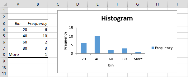
Figure 3 – Histogram data analysis tool output
Caution
You must exercise caution when creating histograms to present the data clearly and accurately. For most purposes, the intervals must be equal in size (except for an unbounded first and/or last interval). Otherwise, a distorted picture of the data may be presented.
To avoid this problem, you should usually use equally spaced intervals. This approach is illustrated in Example 4 of Frequency Tables using Real Statistics’ FREQTABLE function. Alternatively, you can use the Real Statistics Histogram with Normal Curve Overlay data analysis tool.
Real Statistics Data Analysis Tool
Real Statistics Data Analysis Tool: The Histogram with Normal Curve Overlay data analysis tool provided in the Real Statistics Resource Pack can be used to create a frequency table and histogram as illustrated in the following example.
Example 2: Create a frequency table and histogram for the 22 data elements in the range A4:B14 of Figure 1 based on bins of size 15.
Enter Ctrl-m and select the Histogram with Normal Curve Overlay option. Fill in the dialog box that appears as shown in Figure 4.
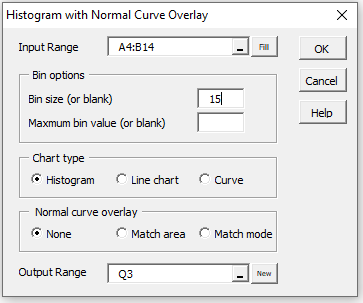
Figure 4 – Dialog box for Histogram data analysis tool
After clicking on the OK button, the output as shown in Figure 5 is displayed.

Figure 5 – Frequency Table and Histogram
Note that if 100 were inserted in the Maximum bin value (or blank) field of Figure 4 then the output would be as shown in Figure 6.
")
Figure 6 – Frequency Table and Histogram (revised)
Curve Option
If the Curve chart option were chosen as shown in the dialog box in Figure 4 then the output for Example 2 would appear as shown in Figure 7.
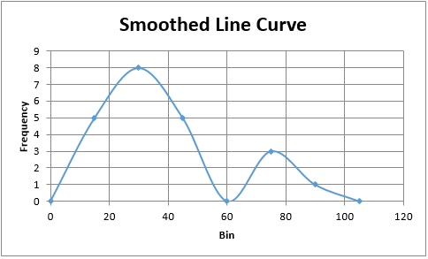
Figure 7 – Smoothed Line Curve
The optimum number of bins
What is the ideal number of bins or bin width? Historically, Sturgis’s Rule was used to answer this question.
![]()
This approach works pretty well for small n (up to about 200). Better approaches were supplied by Scott, namely
![]()
where s = the standard deviation, or Freedman and Diaconis, namely
![]()
where IQR is the interquartile range. The latter is probably more appropriate for data that is not normally distributed.
For Example 1, since n = 22, s = 22.43 and IQR = 21, the appropriate bin width is 28 per Scott or 15 per Freedman and Diaconis; or about 5.5 bins per Sturgis.
Normal Curve Overlay
The histogram (or straight-line chart or smoothed line curve) produced by this data analysis tool can also be overlaid with a normal curve to help determine whether the data is normally distributed. See Histogram with Normal Curve Overlay for more details.
You can also produce a frequency table and histogram of the type described in Example 3 of Discrete Probability Distributions (i.e. without specifying any bins) via the Histogram with Normal Curve Overlay data analysis tool. In this case, you would leave the Bin size field blank in the dialog box shown in Figure 4.
Links
Examples Workbook
Click here to download the Excel workbook with the examples described on this webpage.
References
Wikipedia (2012) Histogram
https://en.wikipedia.org/wiki/Histogram
Hyndman, R. J. (1995) The problem with Sturges’ rule for constructing histograms
https://robjhyndman.com/papers/sturges.pdf
Wand, M. P. (1997) Data-based choice of histogram bin width. The American Statistician, Vol. 51, No. 1, pp. 59-64
https://www.stat.cmu.edu/~rnugent/PCMI2016/papers/WandBinWidth.pdf
Scott, D. W. (1979) On optimal and data-based histograms. Biometrika, Vol. 66, No. 3., pp. 605-610.
https://www.stat.cmu.edu/~rnugent/PCMI2016/papers/ScottBandwidth.pdf
I noticed that you are using Excels Countif function to generate the frequency values. I believe this is too slow compared to the built in Frequency Array Function. I have tested the histogram on a set of 33300 wind speed measurements and the histogram was quite slow. By contrast it is reasonably fast with the frequency array function, which can be inserted with VBA as well.
It would be nice to have an overlay with other distribution fits as well, not only the normal distribution. E.g. the wind speed data follow approximately a Weibull distribution. At present I do this manually by calculating the probability density function and scaling it with the factor (sample size)*(bin size) based on the observation that the area under the histogram is Sum(ni * (bin size))=Sum(ni)*(bin size)=(sample size)*(bin size).
I have to correct my statement. The histogram function is not too slow. It only slows down when I let the program select the bin size for the 33.300 wind speed measurements by itself. If I select a meaningful bin size such as 0.2 m/s the histogram generation is quite fast.
Hello Jens,
I will add using a Weibull overlay to my list of possible future enhancements.
Charles
Hello Dr. Zaiontz,
I have a group of patients who completed a questionnaire scoring from zero to 100 points, zero being a valid score.
The Resource Pack (7.0.6, Excel 2010, Win) builds a histogram, that looks similar to the native Excel histogram.
However, with the Normal Curve Overlay switched on, the first column (score 0) moves to the negative side of the X axis and I cannot find a way to correct this. The design of the chart also changes (greatly improves:) ).
Please advise.
Svetoslav
Dr. Zaiontz,
I understood why the design changes. I believe it is a great idea.
I cannot solve the other issue, though.
Best regards,
Svetoslav
Svetoslav,
Which is the other issue?
Charles
Dr. Zaiontz,
I have a group of patients who completed a questionnaire and some of them had the minimum score of zero points which is a valid score.
My problem is the following:
When I try to build a histogram with normal curve overlay, the first column of the histogram that represents the group of patients with zero points is situated to the left of the Y axis, e.g. from -10 to zero for bin size of 10.
With the basic histogram (without the normal curve overlay), this does not happen, i.e. all the columns of the histogram are to the right of the Y axis.
Thank you for your time and patience!
Svetoslav
Hello Svetoslav,
Are you saying that you prefer that the first bin goes from zero to 10?
If you email me an Excel file with your data and results, I will try to help you resolve this issue.
Charles
Hi,
How can I show % of frequency count in the histogram, in labels
Not just changing the count to % but showing percentage-wise frequency distribution?
I hope I have framed the question properly
thanks
Hello Swati,
1. To create a chart with frequency percentages see
https://real-statistics.com/probability-functions/discrete-probability-distributions/
2. To add labels with these values, follow the following steps:
a) Right click on any of the bars in the histogram
b) Choose the Add Data Labels option
Charles
Ups sorry I though the last messages were at the end and I have repeat the question… Thanks. I will wait for the book
Dear Charles,
Where could we find your book? I prefer printed books…
Thanks very much Charles,
I am using your package almost every day for my phd… Were I could buy your book? I like real books (printed books)
Thanks
Hi Gabriel,
Glad that you are getting value from the Real Statistics software.
The book is still not published. I keep getting distracted and so have not yet finished proof-reading it. I hope to finish it later this year.
Charles
I am very happy with you app. It would be fantastic creating kernell density plot in excel
Thanks very much Charles
Gabriel,
Thank you for your suggestion and see my previous response.
Charles
Hello my name is Gabriel Delgado,
I am from Granada. I would like to say that I am very happy with Real Statistic using excel. Now I am creating confidence ellipses with this App. It would be fantastic to crete Kernell Density 2D plot if possible…
Thanks very much Charles
Hello Gabriel,
I will look into this and add it to my list of possible future enhancements.
Charles
good
Is the upper limit of a bin included in the bin? For example, if my first bin’s upper limit is 39 and I have 39 in my data, will Excel show this point in the first bin/vertical bar OR will it include this in the next bin/vertical bar?
Azfer,
The upper limit of a bin is included in the bin. In your example 39 will be counted in the first bin.
I suggest that you simply create some data and use the Histogram data analysis tool to see that this is the case.
Charles
This has been a great explanation Charles.
Thanks
Thanks this has explained all the information I needed…
Dear Charles,
How can I come up with Kernel Density Estimation from this Histogram?
Best regards,
Kelly,
Kernal Density Estimators are not derived from histogram, but from the raw data. They are an improvement over histograms. E.g. see the following webpage:
http://www.mvstat.net/tduong/research/seminars/seminar-2001-05/
I have not yet covered this topic in the website, but will probably do so shortly.
Charles
Dear Charles,
Thank you very much for your response and the informative webpage.
Best regards,
Kelly