A Dot Plot is another way to view data graphically. A dot plot is somewhat similar to a box plot, except that instead of summarizing the data in each group (the brands in Example 1 of Box Plots), the actual data values are plotted.
Data Analysis Tool
Real Statistics Data Analysis Tool: To generate a dot plot, you can use the Dot Plot option of the Descriptive Statistics and Normality data analysis tool found in the Real Statistics Resource Pack, as described in the following example. See also Creating Dot Plots in Excel for how to create a dot plot manually using Excel’s charting capabilities.
To create a dot plot for the data in Example 1 of Box Plots (repeated in range A3:C13 of Figure 1), press Ctrl-m and select the Descriptive Statistics and Normality data analysis tool. A dialog box will appear (as shown in Figure 4 of Descriptive Statistics Tools). Select the Dot Plot option and insert A3:C13 in the Input Range. Also, make sure that the Headings included with the data option is selected.
As a result, we see the output displayed in Figure 1.
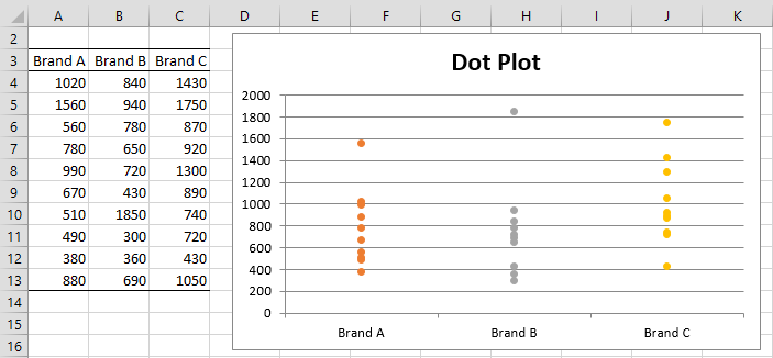
Figure 1 – Dot Plot
Links
Examples Workbook
Click here to download the Excel workbook with the examples described on this webpage.
Reference
Wikipedia (2016) Dot plot (statistics)
https://en.wikipedia.org/wiki/Dot_plot_(statistics)