Excel Box and Whiskers Chart
Starting with Excel 2016, Microsoft added a Box and Whiskers chart capability to Excel. To access this capability for Example 1 of Creating Box Plots in Excel, highlight the data range A2:C11 (from Figure 1) and select Insert > Charts|Statistical > Box and Whiskers. The chart shown on the right side of Figure 1 will appear.
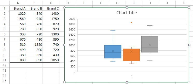
Figure 1 – Excel’s Box and Whiskers chart
You can add a legend as well as chart and axis titles as usual. The box part of the chart is as described in Creating Box Plots in Excel. The whiskers extend up from the top of the box to the largest data element that is less than or equal to 1.5 times the interquartile range (IQR) and down from the bottom of the box to the smallest data element that is larger than 1.5 times the IQR. Values outside this range are considered to be outliers and are represented by a small filled-in circle.
The boundaries of the box and whiskers are calculated as shown in Figure 2. The only outlier is the value 1850 for Brand B, which is higher than the upper whisker, and so is shown as a dot.
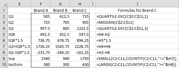
Figure 2 – Formulas for the Box Plot
Note that we could also use the array formula
=MAX(IF(C2:C11<=H7,C2:C11,MIN(C2:C11)))
to calculate the value in cell H9, and the array formula
=MIN(IF(C2:C11>=H8,C2:C11,MAX(C2:C11)))
to calculate a value for cell H10. In fact, since the Excel Box Plot is only available in Excel 2016 or later versions of Excel, we can also use the (non-array) formulas =MAXIFS(C2:C11,”<=”&H7) and =MINIFS(C2:C11,”>=”&H8) that were introduced in Excel 2016.
Real Statistics Data Analysis Tool
The Real Statistics Resource Pack also provides a way of generating box plots with outliers (even for versions of Excel prior to Excel 2016). To produce such a box plot, proceed as in Example 1 of Creating Box Plots in Excel, except that you need to select the Box Plots with Outliers option of the Descriptive Statistics and Normality data analysis tool. The output for Example 1 of Creating Box Plots in Excel is shown in Figure 3.

Figure 3 – Output from Box Plots with Outliers tool
As you can see, the output is similar to that shown in Figure 1. Note too that the Outlier Multiplier is not fixed at 1.5 but can be set to another value by the user (in the dialog box for the Descriptive Statistics and Normality data analysis tool).
Data Analysis Tools Details
The selected Outlier Multiplier is shown in cell F2 of the output displayed in Figure 3. This value is used in calculating the Min and Max values (which are the values at the bottom of the lower whisker and the top of the upper whisker). E.g. cell F12 contains the array formula
=MIN(IF(ISBLANK(A4:A13),””,IF(A4:A13>=F13-$F2*(F15-F13),A4:A13,””)))
and cell F16 contains the formula
=MAX(IF(ISBLANK(A4:A13),””,IF(A4:A13<=F15+$F2*(F15-F13),A4:A13,””))).
If the Percentage option is set on the Configuration dialog box, then you should enter a value 100 times the desired value in the Outlier Multiplier field; e.g. enter 150 if you want a 1.5 outlier multiplier factor. If you leave this field blank, the outlier multiplier factor defaults to 2.2.
Negative numbers are handled like that for Box Plots without Outliers (often using a second y-axis). Keep in mind, though, that a second y-axis is only employed when the lower whisker of at least one of the box plots is negative. If some outlier is negative but none of the lower whiskers are negative, then a second y-axis is not needed.
See Creating Box Plots with Outliers in Excel for how to create a box plot with outliers manually, using only Excel charting capabilities. It also addresses issues that arise when some of the data is negative.
Links
Examples Workbook
Click here to download the Excel workbook with the examples described on this webpage.
Reference
Microsoft (2016) Create a box and whiskers chart
https://support.microsoft.com/en-us/office/create-a-box-and-whisker-chart-62f4219f-db4b-4754-aca8-4743f6190f0d
Hi,
thanks this is very useful, a short question, what is the minimum number of data for Excel to find outliers in a box plot? I have a set of 5 data and it is clear that one of them is an outlier, but the box plot will not indicate this, so I suppose this is because there is a minimum number of (valid) data needed. Could that be?
Hi Hilde,
There is no minimum number of data elements needed. It might be the case that an element needs to be more of an outlier in a small sample, but I am not sure even this is true.
In any case, if you tell me what the 5 data elements are, I will be happy to give my opinion as to whether there is an outlier.
Charles
Hi
I have an old vs new method that I want to compare with box with outliers.
However I have very many datasets to review. (50 plus lines left)
Is there a way to make multiple separate box plots at once?
Instead of making each individually for each line?
Thanks
Saga
Hi Saga,
I don’t know a way of doing this in Excel.
Charles
I am trying to make a horizontal box plot but whenever I try to switch the columns, the outliers and means are in the wrong place. Is there a way to make those values be on the bars in the correct place?
Is there a way to make the y axis logarithmic?
Hello Don,
Not sure what you mean. Perhaps you can use the log of the values in the data set.
Charles
This RealStatistics is a great Excell Add-on!.
Thank you.
I would like to define the whiskers as 1.96*standard deviation of the data. i.e. the data is normally distributed and I want to show the 95% confidence limits and the outliers.
Please can you describe in more detail how to do this?
Thank you.
Hello Chris,
I have not tried to do this, but I guess you can use the same approach as I suggested for the standard box plots, but now you need to decide what you will use in place of the parameters used for the standard box plot. Presumably, you will use the mean instead of the median and mean – 1.96*sd instead of “min” (actually a modified min) and mean + 1.96*sd in place of “max” (this specifies the whiskers). Presumably anything smaller than mean – 1.96*sd or larger than mean + 1.96*sd would be considered to be an outlier. You would still need to specify the end points of the box (perhaps mean +/- 1*sd).
Charles
I’ve created a box plot with 24 values ranging from 1 to 5 (1 rating of 1, 3 ratings of 2, 14 ratings of 3, 5 ratings of 4 and 1 rating of 5). The lowest value of 1 only shows up as an outlier if I click “Show Inner Point”. Why is that?
Note: this issue only happens if I am graphing multiple series on the same graph. If I create a stand alone box chart the value of 1 appears without having to click on “Show Inner Point”
Hi Mary,
I am unaware of this issue. Can you email me an Excel file with your data so that I can figure out what is going on. You can find my email address at Contact Us.
Charles
Hi Charles,
A quick question about outliers:
When I ask for a box plot with outliers, the outliers list often includes one or more zero values (sometimes many more–76 in the output that inspired me to ask this question) even though the data set in question has a minimum value much greater than zero.
Is this some sort of bug? Or, are these being generated correctly by some stats operation that I’m not familiar with? And then, of course, there is always user error! I can just delete these values, but don’t want to if it isn’t appropriate. Please advise when convenient. FYI, I am using Excel 2013 on a Windows 10 machine.
Thanks in advance for your attention to this question. This add on and your website to support it are really excellent!
Regards,
Chris V.
Chris,
Glad that you like the website.
There is no reason why zero couldn’t be an outlier. E.g. in a sample with one data element with zero value and 99 data elements with value 1,000,000, then zero could certainly be considered to be an outlier.
In any case, if you send me an Excel file with your data, I can check to see whether the software is making an error.
Charles
File just sent.
Thanks, Charles!
Chris,
Thanks for sending me the file.
I see that the zero correspond to the blank elements in data range. E.g. in the range A1:D440 containing your data, the last 4 elements in the D column are blank. This generated 4 outliers with value zero. This is an error. I will fix this in the next release of the software. Fortunately, all the other calculations are correct, and so you should just ignore these false outliers.
Charles
Charles,
Thank you for the explanation on the range for the whiskers! Everywhere I searched I got a definition that they showed the upper and lower data point, yet I’d have data points plotted outside the whiskers. You are the first one that helped make sense of this to me.
I’m a novice in statistics and would like to be able to explain the whisker range without using statistical terms. Is there a way to do this?
Brian,
Glad that you got value from the website.
I think that explaining the whisker range is equivalent to explaining “outlier” without using statistical terminology. E.g. the top of the whisker is located at the largest data item that is not an outlier (or at the place where outliers start). This just shifts the issue to how you can describe an outlier in non-statistical terms. How about, “an outlier is an unexpectedly large or small data element”?
Charles
Me too Brian, I have been looking all morning, finally an explanation
Hi Charles,
About the definition of the whisker lines:
I agree with the formulas in Figure 2 (and also with the array formulas) but, even if (or just because?) I am not a native English speaker, the sentence
“The whiskers extend up from the top of the box to the smallest data element that is less than or equal to 1.5 times the interquartile range (IQR) and down from the bottom of the box to the largest data element that is larger than 1.5 times the IQR.”
does not sound pretty right to me. Shouldn’t be instead:
“The whiskers extend up from the top of the box to the nth smallest data element where n is the number of elements that are less than or equal to 1.5 times the interquartile range (IQR) and down from the bottom of the box to the nth largest data element with n being the number of elements that are larger than 1.5 times the IQR.”,
if one would trace the precise syntax of the formula?
Or even more simply:
“The whiskers extend up from the top of the box to the LARGEST data element that is less than or equal to 1.5 times the interquartile range (IQR) and down from the bottom of the box to the SMALLEST data element that is larger than 1.5 times the IQR.”
or something alike… just because, strictly speaking, “the smallest data element that is less than or equal to 1.5 times the interquartile range (IQR)” is simply the smallest data element.
In any case, thank you for your work!
Best regards
Federico
Federico,
Yes, I agree with your final version:
“The whiskers extend up from the top of the box to the LARGEST data element that is less than or equal to 1.5 times the interquartile range (IQR) and down from the bottom of the box to the SMALLEST data element that is larger than 1.5 times the IQR.”
I have now modified the webpage to reflect this. Thanks for catching this error. Compliments on your English!
Charles
Thank you Charles,
Have a nice day!
Federico
How2Stats argues that the Tukey (1977 article) multiplier of 1.5 should be revised to be 2.2, per a later 1986 Tukey publication
https://www.youtube.com/watch?v=2HmopqF6V6w
Jeffrey,
Thanks for bringing this to my attention. I will try revise the box plot to take this into account.
Charles
Jeffrey,
In the next release of the Real Statistics software you will be able to use 1.5, 2.2 or any other value that you want. This release is coming out this week.
Charles
Thanks for your clear definition of the whisker lines! So many other places just say that the whiskers extend to the minimum and maximum values of the data set, but this is obviously not the case when outliers are present and are shown above and/or below the whiskers.
Rod,
Yes, that is correct.
Charles
Dear Charles,
Are outliers acceptable in any statistical output or you should trim or winsorize your data?
Godfrey,
It really depends on how you define “outlier”. If an outlier is a data value that is much higher or lower than the mean or median, then in a large sample you should expect to have some outliers, and typical statistical tests should be able to deal with these. If an outlier is a data value that is much higher or lower than the other data values, then this may violate one of the assumptions of the statistical test (e.g. the homogeneity of variance assumption for ANOVA).
In any case, you shouldn’t automatically resort to triming or winsorizing the data. This may be appropriate sometimes, but then you are essentially testing the trimmed or winsorized data and not the original data. Sometimes it is best to report the results of your test both with the original data and then with the trimmed or winsorized data (or simply with the original data with the outlier(s) removed).
Generally, the first thing you should do is to try to determine whether the outlier occurs because this is a reasonable data value (in which case you don’t want to remove it) or because some error has been made (miscopying the value, leaving out the decimal point, faulty measurement device, etc.), in which case you should either correct the error or leave out this data element(s).
As usual in statistical analysis, judgement is required.
Charles