Histogram
A histogram can be used to determine whether data is normally distributed. This test consists of looking at the histogram and discerning whether it approximates the bell curve shape of a normal distribution.
Example
Example 1: Determine whether the data in column B of Figure 1 are normally distributed using a histogram.

Figure 1 – Testing for normality using a histogram
The sample contains 20 data elements. To make sure that the intervals in the histogram are equal and consistent, we first standardize the data points (in column C) as described in Expectation. E.g. the formula in cell C4 is =STANDARDIZE(B4,$B$24,$B$25). Choosing bins from -2 to 2 standard deviations, we create a histogram as described in Histograms.
As you can see from Figure 1, the histogram doesn’t look particularly normal in shape. Caution should be exercised when using a histogram to test for normality since the choice of bin sizes may have a dramatic effect on the result. See Histograms for how to choose the correct bin size.
PP Plot
A PP plot (point-point plot) is simply a scatter plot comparing two samples of the same size. The more similar the underlying distributions, the more closely the scatter points will conform to a line with slope 1. If the data are standardized then the scatter points would be close to the line y = x.
We can also use a PP plot to compare a data set with a distribution. If the distribution has cdf F(x) and the data set has elements x1, …, xn in ascending order, then the PP plot is the scatter diagram of the set {F(x1), …, F(xn)} versus the set {1/2n, 3/2n, …, 1−1/2n}. Here the second set is an attempt to divide the interval between 0 and n into n evenly spaced intervals (except for the first and last elements which are half the length).
QQ Plot
A QQ plot (quantile-quantile plot) is also used to compare a data set with a distribution and consists of a scatter plot of the data set {x1, …, xn} in ascending order with the values {F-1(1/2n), F-1(3/2n), …, F-1(1−1/2n)}. Here the ith value F-1(i/n−1/2n) is the inverse of the cdf at i/n−1/2n (these are the quantiles).
As for PP plots, if the points on the scatter plot align with the diagonal line y = x then the data set conforms with the distribution.
When using a QQ plot to see whether a data set is normally distributed, you create a scatter diagram between range R1 consisting of the elements x1, …, xn in ascending order and R2 consisting of the values NORM.INV(1/2n, x̄, s), …, NORM.INV(1−1/2n, x̄, s), where x̄ = AVERAGE(R1) and s = STDEV.S(R1).
Alternatively, you can create a scatter diagram between range R1 consisting of the standardized elements z1, …, zn, where each zi = STANDARDIZE(xi, x̄, s), and range R2 consisting of the values NORM.S.INV(1/2n), …, NORM.S.INV(1−1/2n).
A QQ plot is used much more often than a PP plot. PP plots tend to magnify deviations from the distribution in the center, QQ plots tend to magnify deviations in the tails.
Example
Example 2: Using a QQ plot determine whether the data set with 8 elements {-5.2, -3.9, -2.1, 0.2, 1.1, 2.7, 4.9, 5.3} is normally distributed.
The mean of this data set is .375 and the standard deviation is 3.89. If the data set is normally distributed then for any value x, the cumulative distribution at x would be given by
F(x) = NORM.DIST(x, .375, 3.89, TRUE)
We now split the interval (-∞, ∞) into 8 sub-intervals (-∞, x1 ), (x1, x2), …, (x7, x8), (x8, ∞) such that the area under the standard normal curve for the 2nd through 7th intervals are equal and the area under the curve of the first and last intervals are half the size of the middle intervals. This is equivalent to finding points z1, z3, z5, z7, z9, z11, z13 and z15 such that zi = NORM.S.INV(i/16). Thus xi = z2i-1 and if the original data are normally distributed then
F(xi) = NORM.S.INV((2i–1)/16).
We summarize this approach in Figure 2, where we have also standardized the original data so that it is easier to compare the standardized data with the standard normal approximation for each data point (under the assumption that the original data are normally distributed). Finally, we have included a scatter diagram (the QQ plot) of the data vs. the standardized normal data.
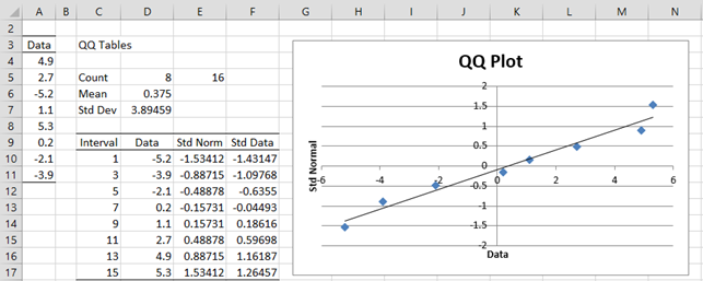
Figure 2 – Using a QQ plot to test for normality
Cells E5. D6 and D7 contain the formulas =2*COUNT(A4:A11), AVERAGE(A4:A11) and STDEV.S(A4:A11). The range D10:D17 contains the data in sorted order, e.g. by using the formula =QSORT(A3:A11). Cell E10 contains the formula =NORM.S.INV(C10/E5) and cell F10 contains the formula =STANDARDIZE(D4,D$6,D$7), and similarly for the other cells in columns E and F.
Chart
We then create a scatter chart from the data in range E10:F17 (as described in Excel Charts) and add a linear trend line (as described in Scatter Plots).
We can see that the data pretty well fits with the trend line, which is a good indicator that the original data is roughly normal. In fact, if the original data is normally distributed, then when the standardized data is plotted against the standard normal values the trend line should be the diagonal line through the origin y = x.
QQ Plot Data Analysis Tool
Real Statistics Data Analysis Tool: The Descriptive Statistics and Normality data analysis tool contained in the Real Statistics Resource Pack allows you to create QQ plots automatically. We illustrate this capability in the following example.
Example 3: Determine whether the data in Example 1 is normal by using a QQ plot. The data is repeated in range A3:A23 of Figure 4.
To run the analysis, press Ctrl-m and select the Descriptive Statistics and Normality option (from the Desc tab when using the multipage user interface). Fill in the dialog box that appears as shown in Figure 3, choosing the QQ Plot option, and then press the OK button.
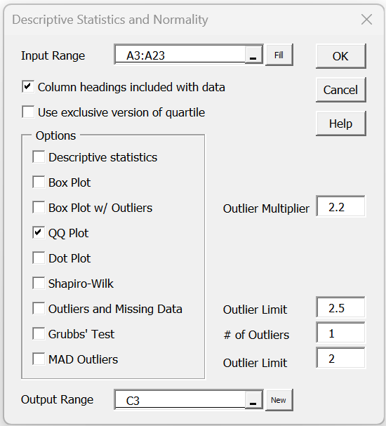
Figure 3 – QQ Plot dialog box
When you click on the OK button, the output shown in Figure 4 is displayed.

Figure 4 – QQ plot for data in Example 1
This time you can see that the data is not particularly normally distributed.
Box Plots
While box plots can’t actually be used to test for normality, they can be useful in testing for symmetry, which sometimes is a sufficient substitute for normality.
Example 4: Use a box plot to gain more evidence as to whether the data in Example 1 is symmetric.
To produce the box plot, press Ctrl-m and select the Descriptive Statistics and Normality option (from the Desc tab when using the multipage user interface). Fill in the dialog box that appears as shown in Figure 3, choosing the Box Plot option instead of (or in addition to) the QQ Plot option, and press the OK button. The output is shown in Figure 5.

As we can see from Figure 5, the data is relatively symmetric, and so although as we saw in Examples 1 and 3, the data is probably not normally distributed, it does appear to be relatively symmetric, which is sufficient for some of the tests that we would like to use.
Examples Workbook
Click here to download the Excel workbook with the examples described on this webpage.
Reference
Howell, D. C. (2010) Statistical methods for psychology (7th ed.). Wadsworth, Cengage Learning.
https://labs.la.utexas.edu/gilden/files/2016/05/Statistics-Text.pdf
Hi Charles,
Thank you for Real stats app.
Well, May I plot an qqplot for 2 Vars? (Apart from normality test)
Thanks
Hi Max,
Sure. You can create a QQ Plot for two variables, although Real Statistics’ data analysis tool doesn’t support this.
Charles
Many Thanks Charles, but that was really the question. Sorry for not writing it better. Anyway, do you think this can be implemented in the future?
I would greatly appreciate it
Best Regards
Hi Max,
I didn’t try to combine multiple QQ plots because I thought it would be confusing. Why do you want such a combined plot?
Charles
no entiendo como sacar skew y kurt
Dear Charles,
How can I test whether the data is normally distributed or not?
For example I have the following values:
Mean – 2,24
Standard error – 0,11
Standard deviation – 0,64
Kurtosis – -0,25
Skewness – -0,61
Hello Johnny,
You can get a rough idea as described on the following webpage provided that you also know the sample size.
https://real-statistics.com/tests-normality-and-symmetry/analysis-skewness-kurtosis/
Charles
Sir,
How can we test whether the data is normally distributed or not? How can we get it from ph stat?
I have answered for the below question like this. Is it correct?
Mean – 26.94
Median – 18.03
Standard Deviation – 33.74
Skewness -4.61
Kurtosis – 24.69
Standard Error – 5.03
In this panel most of values are in the lower portion of the distribution. According to the Box Plot Diagram, distribution of the values is right – skewed (Positive skew) with a skewness value of 4.61. Alternatively, as the Mean > Median, it clearly reflects that the distribution is positively right – skewed.
And as the value of skewness is not more than the twice of standard error, we can assume the data is symmetrically distributed, and therefore it is normal.
The fact that the absolute values of the skewness and kurtosis are greater than 2 indicates that the data is not normally distributed.
See other tests for normality to confirm this.
Charles
so my answer is wrong?
Probably your answer is not correct.
You need to look at the standard error of the skewness (approx. the square root of 6/n) and not the standard error of the data. See the following webpage for more details:
https://real-statistics.com/tests-normality-and-symmetry/analysis-skewness-kurtosis/
Also note that the kurtosis is probably more outside of the bounds of normality than the skewness.
Charles
Sir What is the example that are using Test for symmetry?
Sir What is test for association? and what is the difference between Test for symmetry?
What is McNemar’s Test for symmetry? Uses and Example?
Elsa,
The t test assumes that the data are normally distributed, but it is pretty robust to violations of normality especially when the data are symmetrically distributed.
Association is related to correlation. See the following regarding correlation tests:
Correlation
See the following regarding McNemar’s test
McNemar’s test
Charles
Thank you so much sir. God bless
Sir Charles, Can you please give me the detailed definition of Test for symmetry. I need it sir. I hope you can Help me..
What is Test for symmetry?
What is the used of test for symmetry?
What is the implications of Test for symmetry?
What is the purposed of test for symmetry?
Hello Elsa,
See my previous response regarding some of your questions.
The main reason that you want to test for symmetry is that symmetry is an assumption for other tests. Also some tests that require that the data be normally distributed and quite robust to violations of normality especially when the data is at least symmetrically distributed.
Charles
Thank you so much sir Charles.
Good day sir Charles,
1) What type of variables needed to used the test if two variables are associated?
2) How is association related to symmetry?
3) Sir you said before that The main reason to test for symmetry is that symmetry is an assumption for the other test? Like, what test it is sir?
4) You can test for symmetry using Box Plot or Histogram graph. It is for visual checking the test for symmetry or what sir?
Elsa,
1. The variables need to be numeric or coded as numeric.
2. I don’t know of a relationship.
3. E.g. a test or ANOVA
4. These give evidence for or against symmetry.
Charles
Sir what type of variables that I will used to test if two variables are associated? Nominal or ordinal? Or both nominal and ordinal?
Elsa,
At least ordinal.
Charles
Why it is ordinal sir? and why it is not nominal? Test used to see if two variables are associated.
Elsa,
If you are referring to contingency tables, then there are two types of variables at play: the independent variables (the row and column headings) need only be nominal. The dependent variable needs to be numeric, at the least ordinal, since you can’t compare elements that have no order.
Charles
i am very grateful for this site i enjoyed it very much keep it up
Why do you use NORM.S.INV(1/2n)? for the first element of the partition? Then the area over the tails is half the area over the other intervals- right?
Andy,
It is a bit arbitrary, but this seems to be the best way to deal with the left and right tails of the normal distribution which are actually infinitely long.
Charles
Charles,
Also re the qqplot: it would be good to plot the standard data values on the x axis rather than the raw values. Either as standard or allow the option to plot raw or standardised values. I think qqplots are normally standardised. With raw data the x axis has to be re-scaled after it is drawn.
Thanks,
Joe
Joe,
Thanks for your comment. Actually, the only difference is that the x and y axes are flipped and the data is translated left or right. It shouldn’t need to be re-scaled. In any case, I will consider implementing your suggestion.
Charles
Charles,
I am using Excel 2010 and have downloaded the new .xlam file. I cannot get the qqplot to work. The array function qsort isn’t sorting the data numbers and is getting an error on invalid values. I have deleted the data column in the qqplot data table and rerun the qsort array command myself the the qqplot is then fine. I think there is a bug in the qqplot for Excel 2010.
By the way, the new features and this qqplot in particular are excellent additions to your Excel add-in. Well done!
Regards,
Joe
Joe,
I have not seen this problem before. Can you send me an Excel file with your data and the error that you have identified? You can send this to me at czaiontz@gmail.com.
Charles
Hi Charles, I came across your page and found it very useful to run statistics with Excel. I’ve seen elsewhere that it is possible to plot a confidence tube around the QQ scatter, which would greatly improve the reading of the plot. Thus, I was wondering whether it was possible to do so also in Excel. Thank you!
Jes,
I’ll look into this and consider adding it to the list of future enhancements.
Charles
Fine, I hope the updates will come soon! Thank you for your prompt reply
Jes,
I can’t promise this since I have a long list of potential enhancements and so need to prioritize which ones I can work on.
Charles
While judging the QQ plot, what is the criteria that it is hugging the diagonal reasonably well. Is it only visual or there is a mathematical treatment? I have a variable with more than 1000 data values. Its QQ plot appears reasonably well (to me) but the Shapiro Will test declares it to be non-normal. Will be grateful for guidance.
Pramod,
As far as I am aware of, use of a QQ plot is based on visual inspection. I find Shapiro-Wilk to be the most useful test for normality, but its results should agree reasonably well with the QQ plot.
If you send me an Excel file with your data and test results, I will take a look at it to see why the results are in disagreement. You can find my email address at Contact Us.
Charles
I am extremely sorry I did not see this reply from you and hence had raised a fresh query on the same subject. It is very kind of you to have explained the subject and offered to have a look at my data. I will forward the same.
You have created a great and very useful website on the subject.
Pramod,
Thank you for sending me your data. Let me make the following observations:
1. You are testing for the normality of three samples. The Shapiro-Wilk result is for each of the three samples, while the QQ plot that you have created combines all the data into one sample. You need to create three separate QQ plots. The result won’t be that different, although the QQ plot for sample 1 looks a little less normal than for sample 2.
2. There are a lot of repetitions in the data and so it is a bit difficult for me to determine normality from looking at the QQ plots.
3. While, in my opinion, in general the Shapiro-Wilk test is the best test for normality, it has a weak spot, namely when there are a lot of repetitions. In this case it is better to use the D’Agostino-Pearson test. The p-values for this test for the three samples are .068, .533 and .541. This would indicate that for each sample you can’t reject the null hypothesis that the sample is normally distributed. Clearly, the result for sample 1 is more marginal than for samples 2 and 3 (i.e. there is a higher probability of a type I error).
Charles
I’m very happy to learning from your website, amazing explanation, easy to understand. Great website!
I have a problem about this statement:
A QQ plot (quantile-quantile plot) is a PP plot where the samples points are equally spaced. Given a sample of size n which is normally distributed, if we sort the data elements in ascending order then “the area under the normal curve between each point will be equal.”
the area under the normal curve between each point will be equal, is that means the probability between each point will be the same? I’m try to calculate the area between each point with different between F(x) and can’t get equal values. Am I wrong?
Yes, these paragraphs have not been expressed properly. I have just updated the text to express the concepts more clearly and more accurately
Thanks for identifying this problem.
Charles
I’m trying to plot a QQ plot but I don’t understand how the interval is caluclated in Example 2, Figure 2?
If the sample has n elements then the intervals are based on the endpoints 1, 3, 5, …, 2n-1; i.e. the odd numbers from 1 to 1 less than 2n.
Charles
I am not sure what I am mising, but when drawing the standard normal, I do not get a straight line – using excel. I am assuming that the entire point is to standardize the actual data and plot it over what a normal distribution (with same mean and SD) would look like. Am I wrong?
Are you trying to create a QQ Plot as in Figure 4 of the referenced webpage? If so you should get a straight line when using data from a standard normal distribution. If you send me your data I will try to see what went wrong.
Charles
Sure Charles. can you please provide me with your email address?
You can find it when you click on the Contact Us menu.
Charles
Normally I use spss for statistic work, but the company i do my internship don’t have spps. So I must do it with Excel. So I found this helpful website.
this formula:
F10 contains the formula =STANDARDIZE(B4,B$15,B$16),
isn’t right, because your B cells are empty
Thanks Afke for catching this error. I must have changed the worksheet and forgot to change the reference on the webpage. The correct formula is =STANDARDIZE(D10,D$6,D$7). I have now corrected this on the referenced webpage. Charles