Objective
In this approach, we create a histogram and then add to this chart a normal curve whose area under the curve is the same as the area of the histogram. There are two complications with this approach. First, to place the two graphs on the same chart we can’t use a bar chart for the histogram; instead, we need to use a scatter plot. Second, we need a way to scale the normal curve so that the areas match.
Example
We now show how to create the histogram with overlay for the data in Example 1 of Using Histograms to Test for Normality. We start out by creating a frequency table with bin size of 3 and a maximum bin of 12, as described in Frequency Tables. The result is shown in columns D, E, and F of Figure 1.
Creating the Histogram
Here, cell E5 contains the number 3 and cell D11 contains 12. We then place the formula =D9-$E$5 in cell D8, highlight the range D8:D10, and press Ctrl-D. Next place the formula =COUNTIF($B$4:$B$23,”<=”&D9) in cell F9 and =F9-F8 in cell E9, highlight range E9:F11 and press Ctrl-D.

Figure 1 – Histogram using a scatter chart
To tackle the first issue, we need to represent the frequency table as shown in columns H and I. Here, each value in column D is repeated three times in column H, except for the first and last values which are only repeated twice. The values in column I start and finish with a zero, and in fact, every third cell is a zero. The remaining cells in column I come from the cells in column E with each value in column E repeated twice in column I.
By highlighting the range H5:I14 and selecting Insert > Charts|Scatter (the Scatter with Straight Lines version), you get the histogram shown on the right side of Figure 1.
Specifying the Normal Curve
We now need to add the normal curve to this chart. What we want is a normal curve with the same mean and standard deviation as the original data. These values are calculated in cells L5 and L6 of Figure 2. We then want to plot the normal curve, but first, we need to determine a scaling factor to make the areas match, as shown in range L8:L11 of Figure 2.
We choose to show the normal curve from -4 standard deviations to +4 standard deviations using 101 data points, as shown in range P6:Q106 of Figure 2 (only the first 10 points are displayed). For this data, the normal curve runs from x = -2.459 to 17.559 (as shown in cells L8 and L10). Since we plan to plot 101 points, the distance between each x value and the next is about .2 (cell L9).
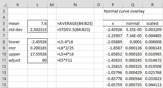
Figure 2 – Adding the normal curve
Thus, cell P6 contains the formula =L8 and cell P7 contains the formula =P6+L$9. Highlighting the range P7:P106 and pressing Ctrl-D fills in all the x values in column P. The corresponding y values are shown in column Q. E.g. Q6 contains the formula =NORM.DIST(P6,L$5,L$6,FALSE). Highlighting range Q6:Q106 and pressing Ctrl-D fills in all the y values in column Q. The area under this normal curve is 1.
We now need to multiply all the y values by the adjustment factor of 60 shown in cell L11, which is the bin size of 3 times the sample size of 20. This represents the area of the histogram. This is done by placing the formula Q6*L$11 in cell R6, highlighting the range R6:R106, and pressing Ctrl-D.
Adding the Normal Curve
We now click on the histogram shown in Figure 1 and select Design > Data|Select Data.
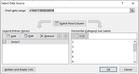
Figure 3 – Select Data Source dialog box
When the dialog box shown in Figure 3 appears, click on the Add button on the left side of the dialog box. Now fill in the dialog box that appears as shown in Figure 4.
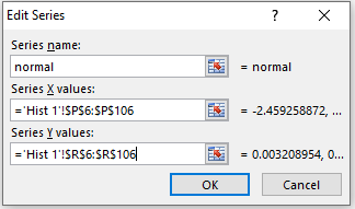
Figure 4 – Add normal series
Next click on the OK button, which brings you back to the dialog box in Figure 3, and press the OK button there (although you can first change the name of the original series from Series1 to histogram). The histogram shown in Figure 1 is now transformed into the chart shown in Figure 5.

Figure 5 – Histogram with Normal Curve Overlay
Data Analysis Tool
Real Statistics Data Analysis Tool: As described in Histogram with Normal Curve Overlay, the Real Statistics Histogram and Normal Curve Overlay data analysis tool enables you to not only create a histogram for your data but to overlay it with a normal curve. The closer the normal curve is to your histogram, the more likely that the data are normally distributed.
To use this approach for the data in column B of Figure 1, press Ctrl-m and select the Histogram and Normal Curve Overlay option. Fill in the dialog box that appears as shown in Figure 6.

Figure 6 – Histogram dialog box
After pressing the OK button, the output shown in Figure 7 appears.
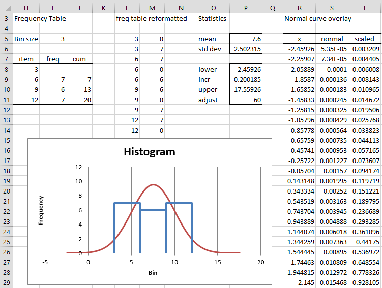
Figure 7 – Histogram with Normal Curve Overlay
Note that the dialog box in Figure 6 offers the Match mode option. In this case, the normal curve has the same height as the histogram instead of the same area. All the calculations are the same as for the Match area option, except that the adjustment value in cell P11 of Figure 7 is now calculated by the formula =MAX(I9:I11)/MAX(S6:S106). Alternatively, the adjustment value in cell L11 of Figure 2 can be calculated by the formula =MAX(E9:E11)/MAX(Q6:Q106).
Generally, you should use the Match area option.
Worksheet Function
Real Statistics Function: The following array function is provided in the Real Statistics Resource Pack. Here, R1 is a two-column range that contains a frequency table.
FREQ_REFORMAT(R1): returns a two-column range with the data equivalent to that in R1 but suitable to create a histogram via a scatter plot
E.g. range L5:L14 in Figure G contains the array formula =FREQ_REFORMAT(H9:I11). Note that the argument in the formula is H9:I11 and not H8:I11.
Examples Workbook
Click here to download the Excel workbook with the examples described on this webpage.
References
Wikipedia (2012) Histogram
https://en.wikipedia.org/wiki/Histogram
Peltier, J. (2017) Histogram with normal curve overlay
https://peltiertech.com/histogram-normal-curve-overlay/