Basic Concepts
To better visualize the association between two data sets {x1, …, xn} and {y1, …, yn} you can employ a chart called a scatter diagram (also called a scatter plot). This is done in Excel by highlighting the data in the two data sets and selecting Insert > Charts|Scatter.
Figure 1 illustrates the relationship between a scatter diagram and the correlation coefficient (or covariance).

Figure 1 – Scatter diagrams
Notice that the x and y values in the example with r = .976 are very strongly positively correlated. This is not too surprising since r is almost at its maximum value of 1. In the example with r = -.912, the linear correlation is also quite strong, but negative (note that the slope of the line that seems to fit the data is negative).
For the examples where r = .300 and r = .068, there is no apparent linear relationship between x and y. In fact, in the latter case, it seems that the points are randomly scattered. This is generally so when the correlation coefficient is near zero.
As can be seen in Figure 2, the correlation coefficient can be relatively high (r = .600) even when there is no linear association between the variables.
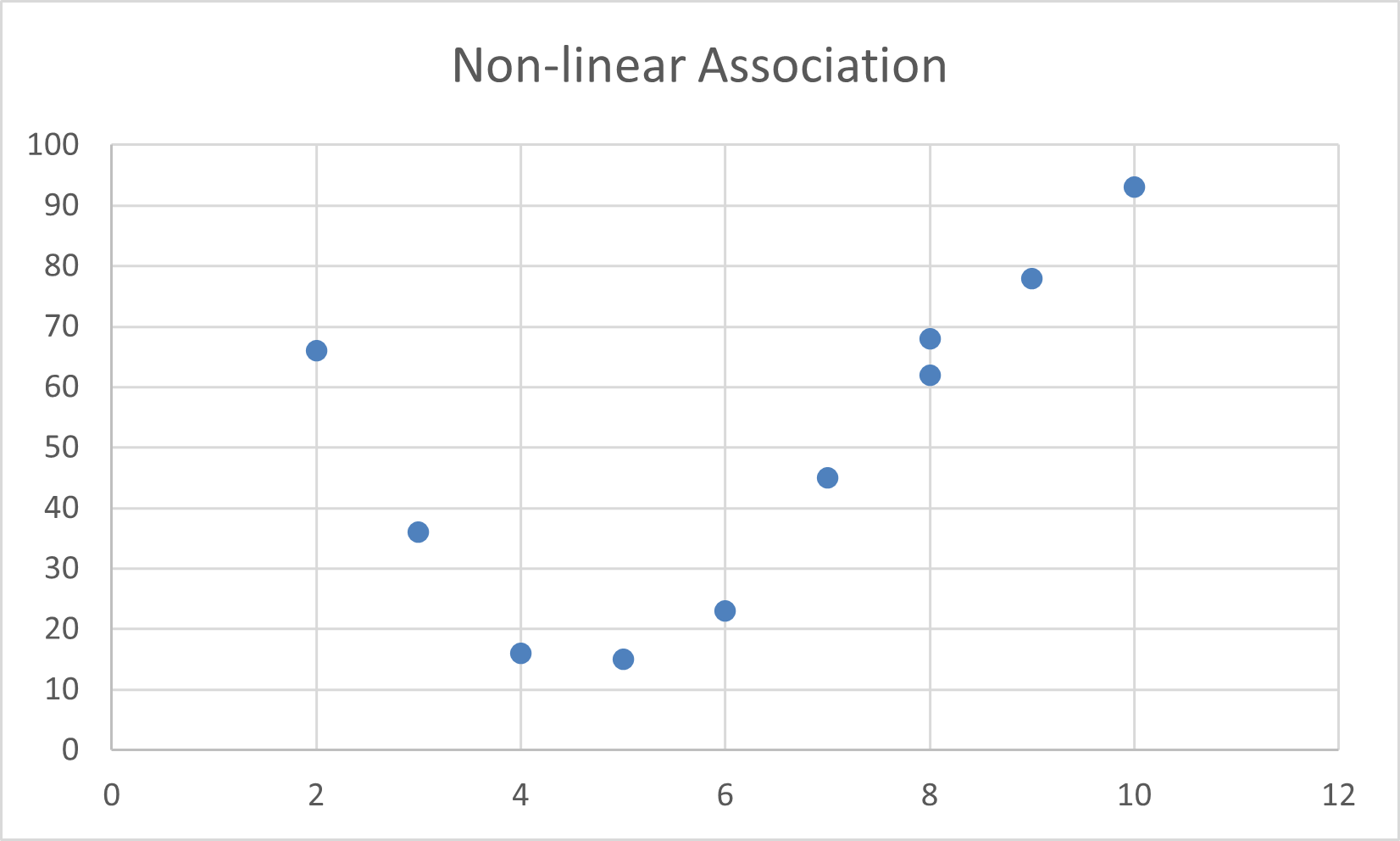
Figure 2 – Non-linear association (r = .600)
Excel Support
You can build scatter diagrams in Excel as described in Excel Charts.
Real Statistics Support
Real Statistics Data Analysis Tool: You can use Real Statistics’ Multiple Scatter Chart data analysis tool to create one or more scatter plots.
Example 1: Create two scatter plots for X1 vs. Y and X2 vs. Y based on the data on the left side of Figure 1.
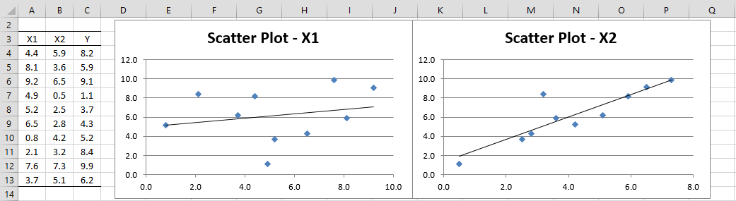
Figure 3 – Multiple Scatter Charts
Press Ctrl-m and select the Multiple Scatter Chart option (from the Desc tab when using the multipage user interface) and then fill in the dialog that appears as shown in Figure 4 (optionally you can enter A3:C13 in the Input Range X field and leave the Input Range Y field blank).
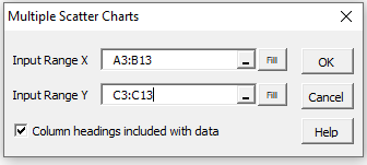
Figure 4 – Multiple Scatter Chart dialog box
Upon clicking on the OK button, the output on the right side of Figure 3 is displayed.
Examples Workbook
Click here to download the Excel workbook with the examples described on this webpage.
Reference
Wikipedia (2012) Scatter plot
https://en.wikipedia.org/wiki/Scatter_plot#:~:text=A%20scatter%20plot%20(also%20called,for%20a%20set%20of%20data.
Can you a scatter diagram with more than 2 variables?
Hello Ignacio,
You can do multiple scatter diagrams as explained at the end of this webpage, but there is no 3D (or more than 3D) scatter diagram support.
Charles
what about q-q or p-p plot when considering single variable