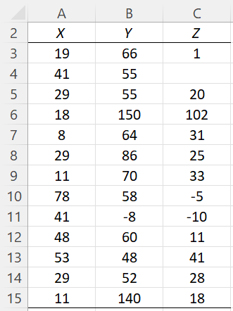
On this webpage, we describe in detail the QQ Plot and Dot Plot options of the Real Statistics Descriptive Statistics and Normality data analysis tool. We use the example data shown in Figure 3 of the Descriptive Statistics and Normality Tool, repeated in Figure 1 below.
Figure 1 – Example data
QQ Plot
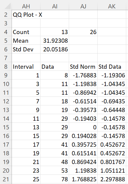
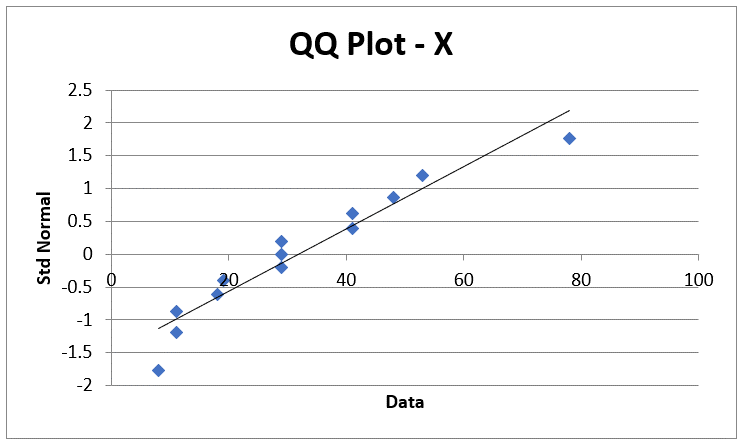
When this option is selected a QQ plot is produced for the data in each column of the Input Range (shown in Figure 1). Thus, for each column, a table plus an Excel chart is output. For the X data set of the example, these are shown in Figures 2 and 3.
Figure 2 – QQ Plot table (one of 3 tables)
Figure 3 – QQ Plot for X
Since the data elements (the diamonds) on the chart in Figure 3 align reasonably well with the diagonal line, we conclude that the data in X probably comes from a normally distributed population. We probably have more doubts about data sets Y and Z based on the QQ plots that are output, as shown in Figure 4.
Note that since any outliers are included in the QQ plots, these may account for the data appearing to deviate from normality.
Figure 4 – QQ plots for Y and Z
QQ Plot Details
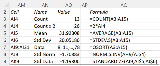
Representative formulas for Figure 2 are shown in Figure 5.
Figure 5 – QQ plot details
See Graphic Tests for Normality and Symmetry (QQ Plots) for more information about the QQ Plot option. See also Measures of Central Tendency, Measures of Variability, Standard Normal Distribution, Expectation, and Sorting and Removing Duplicates for more information about the worksheet functions described in Figure 5.
Dot Plot
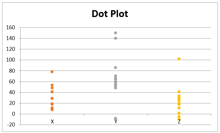
A Dot Plot is another way to view data graphically where the actual data values for each column in the Input Range (shown in Figure 1) are plotted. For the example data, the output is displayed in Figure 6.
Figure 6 – Dot Plot
If you change any of the values in Figure 3, the values output in Figure 6 will change accordingly.
If you add elements to the data sets in Figure 1, these will not appear in Figure 6. Replacing any of the numeric values with a blank or non-numeric value will result in that element disappearing from the dot plot.
See Dot Plots for more information.
