We now show how to create charts in Excel with more than one line on the same chart.
Example
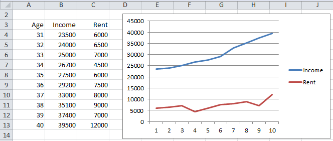
Example 1 – Create a line chart comparing the average income and rent for a sample of people in their thirties by age based on the data in Figure 1.
Figure 1 – Line Chart for two series
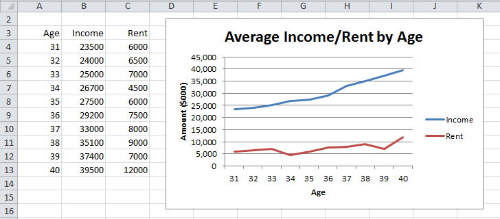
We highlight the range B3:C13 and select Insert > Charts|Line and make the same sort of modifications that we made in Excel Line Charts, except that we keep the legend since it distinguishes between the income and rent graphs. The result is shown in Figure 2.
Figure 2 – Line Chart with two series (revised view)
Observations
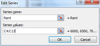
If we had already created the chart shown in Figure 2 of Excel Line Charts, we could add the Rent graph to the chart by clicking on the chart and selecting Design > Select Data. This brings up the dialog box shown in Figure 3 of Excel Line Charts. This time click on the Add button on the left side of the dialog box. In the dialog box that appears (see Figure 3) enter Rent as the Series name and C4:C13 as the series values and then click on the OK button.
In Example 1 the two columns of data (Income and Rent) are contiguous. If they are not contiguous, you could highlight the first range and then, holding down the Ctrl key, highlight the second range. This would select both ranges.

Figure 3 – Edit series dialog box
The result is the chart shown in Figure 1.
Examples Workbook
Click here to download the Excel workbook with the examples described on this webpage.
References
Microsoft (2021) Create a chart from start to finish
https://support.microsoft.com/en-us/office/create-a-chart-from-start-to-finish-0baf399e-dd61-4e18-8a73-b3fd5d5680c2


Thanks a lot for sharing knowledge generously to all knowledge-thirsty ones.
Lugusbenitovk@yhaoo.com