Objective
We show how to use Excel’s charting capability to create a graph comparing the means of multiple samples and including vertical bars to show the interval around the mean of one standard error, i.e. (x̄ – s.e., x̄ + s.e.), or for that matter any reasonable interval around the mean. We show how this is done via the following example.
Example
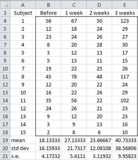
Example 1: Draw a graph comparing the means of the five samples in Figure 1 (which is a modified version of the data in Example 1 of ANOVA with Repeated Measures: one within-subjects factor). For each sample, also show the interval of one standard error on either side of the mean.
Figure 1 – Data for four samples
We calculate the standard error for each sample (row 21 of Figure 1) as described in Basic Concepts of Sampling Distributions. We now show the steps required to create the desired graph.
- Highlight the sample means (range B19:E19 of Figure 1) and then select Insert > Charts|Line and choose the Line with Markers option.
- Under Chart Tools select Layout > Analysis|Error Bars and then More Error Bar Options > Vertical Error Bars
- Now select Both, Cap and Custom radio buttons, and click Specify Value
- On the dialog box that is displayed enter the range where the standard error is stored (B21:E21 in Figure 1) in both of the boxes that are displayed, and then click OK and then Close.
Enhancing the chart
You can now clean up the chart as described in Charts, namely:
- Under Chart Tools select Design > Data|Select Data. On the dialog box that pops up click Edit in the Horizontal (Category) Axis Labels section (on the right side). In the dialog box that appears enter the names of the four samples (i.e. enter the range B4:E4) and then press OK twice.
- Now add the vertical axis title and chart title and remove the legend.
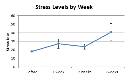
The resulting chart is as in Figure 2.
Figure 2 – Chart of means with intervals of one standard error
Examples Workbook
Click here to download the Excel workbook with the examples described on this webpage.
References
Microsoft (2016) Add, change, or remove error bars in a chart
https://support.microsoft.com/en-us/office/add-change-or-remove-error-bars-in-a-chart-e6d12c87-8533-4cd6-a3f5-864049a145f0
GeeksforGeeks (2024) How to add error bars in Excel
https://www.geeksforgeeks.org/excel/error-bars-in-excel/


this is so real 😳