CA Plots
We now create CA plots for rows and columns in Figure 1. This is the main objective of correspondence analysis. The rows plot is a scatter plot consisting of the six points corresponding to the factor coordinates of each of the row profiles described in Figure 6 of Correspondence Analysis Basic Concepts. Similarly, the columns plot is a scatter plot consisting of the four points corresponding to the factor coordinates of each of the column profiles.
Figure 1 – CA Row and CA Column Plots
Explanation
As you can see from the left side of Figure 1, factor 1 seems to separate price from features and factor 2 seems to separate the hardware characteristic from non-hardware characteristics. Characteristics that are close together (e.g. software and camera) have similar profiles, while those that are far apart have different profiles (e.g. design and price).
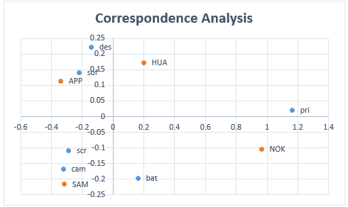
It is common to combine both CA plots into one plot, as shown in Figure 2. Caution should be exercised regarding the distances between row points and column points. E.g. even though APP and sof are close together in the chart, it should be remembered that Apple (APP) and software (sof) use completely different versions of two-dimensional space, and so we can’t conclude there is any similarity between the APP and sof profiles.
Figure 2 – Combined CA Plot
Examples Workbook
Click here to download the Excel workbook with the examples described on this webpage.
References
Hintze, J. L. (2007) Correspondence analysis. NCSS.
https://www.ncss.com/wp-content/themes/ncss/pdf/Procedures/NCSS/Correspondence_Analysis.pdf
Garson, G. D. (2012) Correspondence Analysis. Asheboro, NC: Statistical Associates Publishers.
Yelland, P. M. (2010) An introduction to correspondence analysis. The Mathematica Journal
https://www.mathematica-journal.com/2010/09/20/an-introduction-to-correspondence-analysis/

