Introduction
When looking for leading indicators, especially when doing financial analysis, instead of evaluating the correlation between two time series, it is often beneficial to investigate the correlation between one time series and the other with a time lag.
For example, the consumer confidence index (CCI) is considered by many economists to be a leading indicator of a gross domestic product (GDP) rise or fall. There is a lag between a lower CCI and the onset of a recession. For a company marketing spend may be a leading indicator of revenues with a lag of a few months.
The analysis of a leading indicator can be carried out using cross-correlation, as explained in the following example.
Example
Example 1: Evaluate inventory as a leading indicator of a company’s revenues based on the data on the left side of Figure 1.

Figure 1 – Cross Correlation at Lag 0
We create the chart on the right side of Figure 1 by highlighting range A3:C21 and selecting Insert > Charts|Insert Line Chart. Since the inventory and revenue time series have a different scale, we need to add a secondary vertical axis. This is done by clicking anywhere on the revenue line (in red) on the chart and selecting Chart Tools|Design > Type|Change Chart Type. On the bottom of the dialog box that appears click on the Secondary Axis checkbox corresponding to the Revenue line chart as shown in Figure 2.
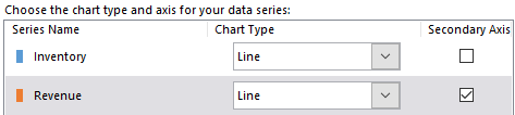
Figure 2 – Add secondary axis
No demonstrable relationship between the inventory and revenue time series is discernible in the chart shown in Figure 1. However, if instead, we create a chart with inventory lagging 3 months behind revenue the situation is quite different. To create this chart, highlight range B4:B18 and while holding down the Ctrl key highlight range C7:C21. Next select Insert > Charts|Insert Line Chart and add the secondary axis as described above.
Finalizing the chart
The two line charts are labeled Series1 and Series2. We can replace these labels by selecting Chart Tools|Design > Data|Select Data and editing these labels on the dialog box that appears. The result is shown in Figure 3 and shows that there is a direct association between inventory and revenue 3 months later.
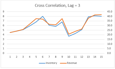
Figure 3 – Cross correlation with lag 3
Note that we can also change the labels on the horizontal axis to conform with the revenues by selecting Chart Tools|Design > Data|Select Data as before and clicking on the Edit button on the right side of the dialog box that appears and highlighting the range A7:A21, and pressing the OK button.
Choosing the lag
How did we know to use lag 3? One way to decide this is to look at the correlation between the two time series at various lags and identify the lag that produces the highest correlation coefficient, or assuming that there can be an inverse correlation between the two time series, the highest correlation in absolute value. We do this in Figure 4.
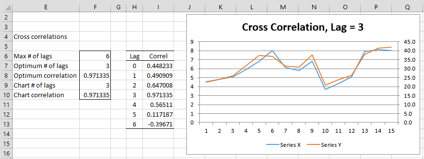
Figure 4 – Cross Correlations
Here, we look at the correlations for lags between 0 and 6 (columns H and I). Cell I7 contains the formula =CORREL(B4:B21,C4:C21), cell I8 contains the worksheet formula =CORREL(B4:B20,C5:C21), cell I9 contains the formula =CORREL(B4:B19,C6:C21), etc. We see that the maximum correlation is 0.971335, which occurs in cell I10 when lag = 3.
Note that cell F8 contains the array formula =MAX(ABS(I7:I13)) and cell F7 contains the array formula =INDEX(H7:H13,MATCH(F8,ABS(I7:I13),0),1). These cells locate the desired lag and maximum correlation.
Finally, note that we can fill column I by first inserting the following array formula in cell I7 and then highlighting range I7:I13 and pressing the key sequence Ctrl-D.
=CORREL(OFFSET(B$4:B$21,0,0,COUNT(B$4:B$21)-H7,1),OFFSET(C$4:C$21,H7,0,COUNT(C$4:C$21)-H7,1))
Data Analysis Tool
Real Statistics Data Analysis Tool: The Real Statistics Resource Pack provides the Cross Correlation data analysis tool which automates the above process.
To do this for Example 1, press Ctrl-m and select the Cross Correlations data analysis tool from the Time S tab (or the Time Series data analysis tool if you are using the original user interface). Fill in the dialog box that appears as shown in Figure 5.
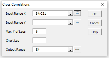
Figure 5 – Cross Correlations dialog box
Note that the Input Range X specifies the first time series (inventory) and Input Range Y specifies the second time series (revenue). Since these are contiguous with the Y time series after the X series, we can specify both in the first input field and leave the second field blank (as indicated in Figure 5). Note too that column headings are not included in the input ranges and the months (from column A) are not specified.
Since we leave the Chart Lag field blank, the lag which provides the largest correlation in absolute value is used.
Output
Upon pressing the OK button, the output shown in Figure 4 is displayed. If you want to chart the cross correlation at some other lag besides the optimum lag, you may specify this in the Chart Lag field. E.g. if you insert 0 in the Chart Lag field, then the output would be as shown in Figure 4 except that cell F9 would contain 0 and cell F10 would contain .448233, based on the formula =INDEX(I7:I13,F9+1,1), and the chart would instead be similar to that Figure 1.
Finally, note that if you change the values in the input B4:C21, these new values will automatically be reflected in the output, however, you can’t change the chart generated by simply changing the value in cell F9 (of Figure 4) in the output.
Examples Workbook
Click here to download the Excel workbook with the examples described on this webpage.
References
Hyndman, R. J. (2010) Why every statistician should know about cross-validation
https://robjhyndman.com/hyndsight/crossvalidation/#:~:text=Cross%2Dvalidation%20is%20primarily%20a,necessarily%20mean%20a%20good%20model.
Stack Exchange (2015) How to compute R-squared value when doing cross-validation
https://stats.stackexchange.com/questions/129937/how-to-compute-r-squared-value-when-doing-cross-validation
Thanks for the explanation. Helped a lot to understand the concept of cross-correlation.
Regards