We now show how to create charts of the confidence and prediction intervals for a linear regression model.
Example
Example 1: Create a chart of the 95% confidence and prediction intervals for Example 1 of the Confidence and Prediction Intervals (whose data is duplicated in columns A and B of Figure 1).
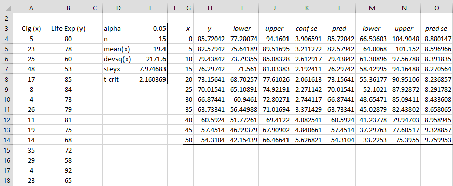
We first create the entries in column E of Figure 1. Cell E4 contains the worksheet formula =COUNT(A4:A18), cell E5 contains =AVERAGE(A4:A18), cell E6 contains =DEVSQ(A4:A18), cell E7 contains =STEYX(B4:B18,A4:A18) and cell E8 contains =T.INV.2T(E3,E4-2).
Figure 1 – Data for Confidence and Prediction Intervals
To create the chart of the 95% confidence interval, we first fill in columns G through K. First we calculate the values found on the regression line (column H) for representative values of x (shown in column G) and then fill in the standard errors (column K) and lower and upper ends of the confidence interval (columns I and J).
This is accomplished by placing =FORECAST(G4,B$4:B$18,A$4:A$18) in cell H4, the formula =$E$7*SQRT(1/$E$4+(G4-$E$5)^2/$E$6) in cell K4, =H4-$E$8*K4 in cell I4 and =H4+$E$8*K4 in cell J4. Next, the range H4:K18 is highlighted and Ctrl-D is pressed.
[Alternatively, you can insert =TREND(B4:B18,A4:A18,G4:G14) in range H4:H18 and then fill in cells I4, J4, and K4 as described above, highlight range U4:K18 and then press Ctrl-D.]
Finally, the range H3:J18 is highlighted, and Insert > Charts|Line Chart is selected. The chart is then modified as described in Excel Charts. We make the line for the upper and confidence interval dotted by clicking on any point on the line and selecting Format > Shape Styles|Shape Outline and then clicking on the Dashes option.
Charts
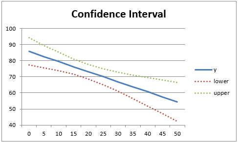
The resulting chart is shown in Figure 2.

Figure 2 – Regression confidence interval chart
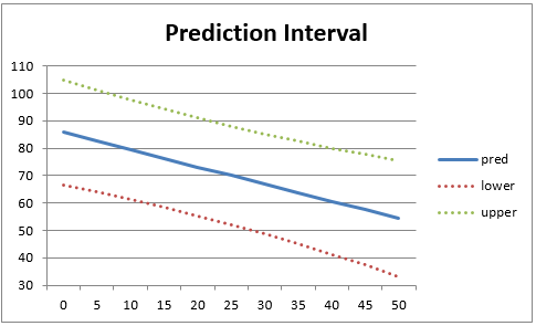
The chart of the prediction intervals is created in the same way, except that this time we use the formula =$E$7*SQRT(1+1/$E$4+(G4-$E$5)^2/$E$6) for the standard error in cell O4. The chart is shown in Figure 3. Note that the prediction interval is wider than the confidence interval.

Figure 3 – Regression prediction interval chart
Data Analysis Tool
Real Statistics Data Analysis Tool: The confidence and prediction intervals can also be generated by using the Confidence and Prediction Interval Plot data analysis tool.
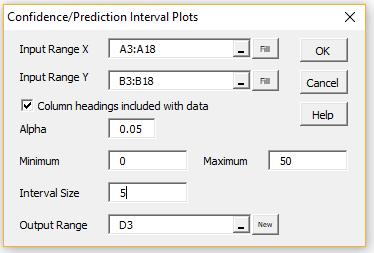
To generate the charts shown in Figures 2 and 3 (as well as the summary shown in Figure 1) perform the following steps: Enter Ctrl-m and double-click on the Regression option in the dialog box that appears (or click on the Reg tab in the multipage interface). Next select Confidence and Prediction Interval Plots from the list of options. Fill in the dialog box that appears as shown in Figure 4.
Figure 4 – Regression Interval Plots dialog box
Note that in the output, cell E3 of Figure 1 is automatically filled with the value .05. You can change this to any alpha value you like and the rest of the values will be recalculated and the charts adjusted as required.
Examples Workbook
Click here to download the Excel workbook with the examples described on this webpage.
References
Howell, D. C. (2010) Statistical methods for psychology (7th ed.). Wadsworth, Cengage Learning.
https://labs.la.utexas.edu/gilden/files/2016/05/Statistics-Text.pdf


How do i plot the original data in the Prediction Interval
plots??
Rakesh,
There are probably other ways of doing this, but here is my quick-and-dirty approach. I will demonstrate this using the spreadsheet shown in Figure 1.
1. I need to add a scatter plot to the existing chart with the original data points, but the Prediction Interval plot already establishes the valid x values. Thus, I need to use approximate x values for the original data. E.g. the point (5, 80) is not a problem since 5 occurs in column G. The point (48, 53) is a problem since 48 doesn’t occur in column G. I will approximate this point by (50,53) since 50 does occur in column G. Note that if I had used an Interval Size of 1 instead of 5 in Figure 4, then I wouldn’t need to use any approximate x values.
2. To accomplish this, I need to enter the y data values corresponding to the x data values in columns Q, R, S, and T. I need multiple columns since some x values are repeated multiple times. E.g. x = 5 occurs in A4, A10, and A17. Here I am approximating x = 4 by x = 5. Thus, I place the values of B4, B10, and B17 (i.e. 80, 73, 92) in cells Q5, R5, and S5. Note that since none of the original x values correspond to x = 0, I leave the values in Q4, R4, S4 and T4 blank.
3. The result is that range Q4:Q14 contains the values blank, 80, 84, 85, 75, 78, 58, 72, blank, blank, 53. R4:R14 contains blank, 73, 81, 68, blank, 60, and the rest blanks. S4:S14 contains all blanks except for 92 in cell S5 and 79 in S9. Finally, T4:T14 contains all blanks except for 65 in cell T9.
Note that if you had used an Interval Size of 1 instead of 5 in Figure 4, then you would only need to fill in two columns Q (with 13 non-blanks elements) and R (with only 2 non-blank elements).
4. Now you need to add the data in Q4:Q14 to the chart. You do this by clicking on the chart and selecting Chart Design > Data|Select Data from the ribbon. In the dialog box that appears, click on the Add button, and enter Data for the Series Name and Q4:Q14 for the Series Values. You need to repeat this operation 3 more times for the data in R4:R14, S4:S14, and T4:T14.
5. The problem you have now is that the new series have been drawn as line graphs instead of scatter plots. To fix this, you need to click on any of the points in the chart and then select Chart Design > Type|Change Data Type from the ribbon. You now change the Chart Type for the 4 new series from Line to Scatter.
6. You could have avoided some of these steps if you had made sure that x values for all the original data points had appeared in the data used to create the prediction interval plot.
Charles
Mister Charles, I have other question what is the difference between confidence interval and predition interval?.
Thank you.
by Adolfo from Perú
Mister Charles, Thanks a lot for your excel file, this help me to do one analysis in excel of a reliability case study, can I use this excel to calculate the confidence limit for my predictions. Please, answer my question because I want to implement this in my program.
From Perú, Adolf.
Hello Adolfo,
Yes, you can use Excel to create the prediction interval as described at
https://real-statistics.com/regression/confidence-and-prediction-intervals/
Charles
Hi Charles,
I am trying to use this to obtain similar graph for following set of data;
X axis – time in months – 1,3,6,9,12
Y axis – assay – 100,99.5,99,98.5,99.
I want to obtain the predicted assay values up to 60 months and plot these numbers in regression confidence interval chart. I am trying with example worksheet, however, unable to do so. if you can try putting above numbers and send me the worksheet with predicted values and graphs, would be great.
Hi Dinesh,
If I understand correctly, you have 5 months of data and want to predict 60 months. With so little data I wouldn’t expect too much from these predictions.
In any case, you can make such predictions, as described on the webpage. You say that you are unable to do this. What sort of problems are you encountering?
Charles
Charles,
I noticed that you compute the PI and CI using a formula that look slightly different than many textbook formulas I’ve seen. It works, but can you please provide a source where you got this from so I can think through it. Thank you, Bryan
Hello Bryan,
I am using the formulas at
https://www.real-statistics.com/regression/confidence-and-prediction-intervals/
These are equivalent to the formulas shown at
https://www.real-statistics.com/multiple-regression/confidence-and-prediction-intervals/
when there is only one independent variable. See also
https://people.stfx.ca/bliengme/exceltips/regressionanalysisconfidence2.htm
Charles
Hello, I need the information regarding the How to get data from column G-K ? I am trying to calculate for my data. Please would you explain?
Thank you.
Regards,
Chintan.
Chintan,
I have added a link to the webpage which you can use to download the spreadsheet used to create the plots. It shows the formulas used for columns G-K.
Charles