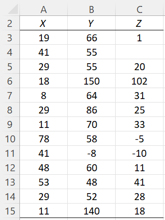
On this webpage, we describe in detail the Box Plot and Box Plot w/ Outliers options of the Real Statistics Descriptive Statistics and Normality data analysis tool. We use the example data shown in Figure 3 of the Descriptive Statistics and Normality Tool, repeated in Figure 1 below.
Figure 1 – Example data
Box Plot option
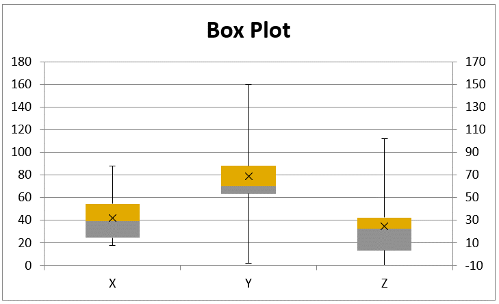
Box plots provide a pictorial representation of the following statistics for each of the three data sets: maximum, 75th percentile, median (50th percentile), mean, 25th percentile, and minimum.
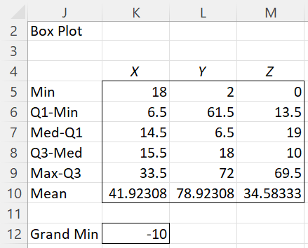
The output from this option is shown in Figure 2, with the accompanying chart shown in Figure 3.
Figure 2 – Box Plot table
Figure 3 – Box Plots
Note that because there is at least one negative value in the data, the least of which is -10, as shown in cell K11 of Figure 2, all the values are shifted up by 10 units so that all the data can be treated as non-negative. The labels for the y-axis shown on the right side of Figure 3 are based on the original data, while those on the left side are based on the values shifted up by 10 units.
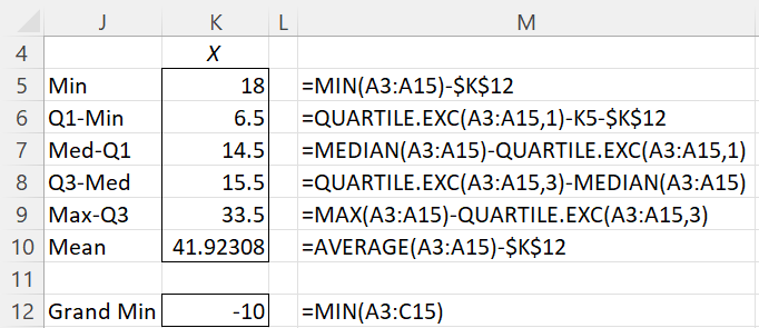
This shifting is also reflected in Figure 4, which shows the formulas used in Figure 2 for the X data set.
Figure 4 – Box Plot details
If the Use exclusive version of quartile field in Figure 2 of Descriptive Statistics and Normality Tool were not checked, then the QUARTILE.EXC formulas shown in Figure 4 would be replaced by similar formulas using the QUARTILE function.
If the data range that you insert into the Input Range field of the dialog box in Figure 2 of Descriptive Statistics and Normality Tool, doesn’t contain any negative values, then no Grand Min entry will be displayed in the output and the formulas used won’t make any reference to a Grand Min. Furthermore, only the labels for the y-axis shown on the left side of Figure 3 will be displayed and there won’t be any need for a second set of labels on the right side of the figure.
If you change any of the values in Figure 1, the values output in Figures 2 and 3 will change accordingly, with one exception. You can’t make any change that will change the value of the Gran Min (cell K12 in Figure 2) in the case where you started with at least one negative data value. In the case where you started with no negative data values, you can’t change any data element to a negative value.
If you add additional elements to the data sets in Figure 1, these will not be considered. If you replace any of the numeric values with a blank or non-numeric value, then this element will no longer figure into the calculation of the various statistics displayed in Figure 2.
See Creating Box Plots in Excel for more information about the Box Plot option. See also Measures of Central Tendency and Ranking Functions in Excel for more information about the worksheet functions described in Figure 4.
Box Plot w/ Outliers
The Box Plot w/ Outliers option produces output like that produced by the Box Plot option, except that now potential outliers are indicated by a small circle. When an element in a data set is flagged as an outlier is determined by the Outlier Multiplier field shown in Figure 2 of Descriptive Statistics and Normality Tool. The default for this field is 2.2, but you can change it to any value between 1.0 and 6.0.
More precisely, a data element x is an outlier for the data set in any column of the Input Range provided
x < Q1 – IQR*m or x > Q3 + IQR*m
Here, IQR is the inter-quartile range for the data set, Q1 is the first quartile, Q3 is the third quartile, and m is the value in the Outlier Multiplier field. See the comments following Figure 7 for more details.
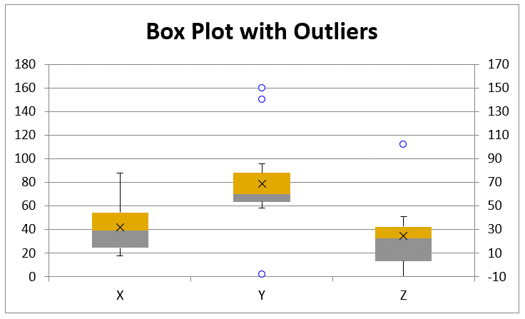
The output from this option is shown in Figure 5, with the accompanying chart shown in Figure 6.
Figure 5 – Box Plots with Outliers tables
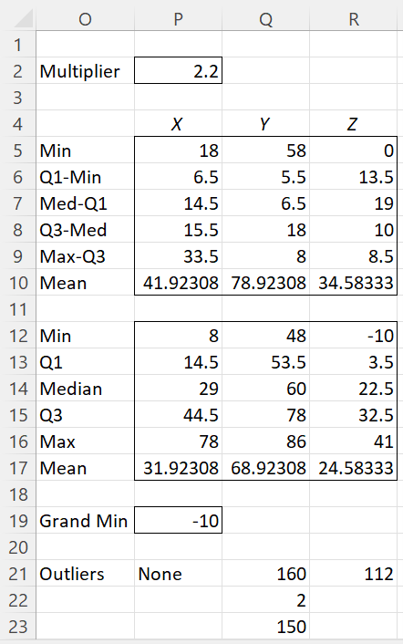
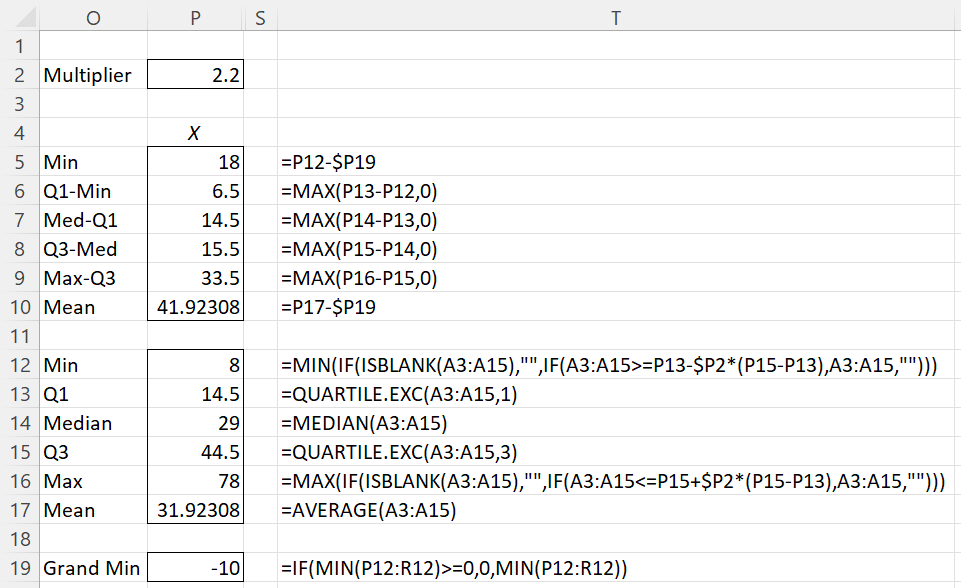
The upper table (range O5:R10) of Figure 5 is used to create the chart in Figure 6. The lower table (range O12:R23) is used to create the upper table. The formulas used for column P of Figure 5 are described in Figure 7.
Note that Min and Max values are not the minimum and maximum data values offset by the Grand Min, as in Figure 2. The Min value for each column is the smallest data value that is not an outlier. Similarly, the Max value is the largest value that is not an outlier.
We see from Figure 5 that data set X contains no outliers; data set Y contains three outliers 2, 150, and 160, which represent the data values -8, 140, and 150 adjusted by -10, the Grand Min; while data set Z contains one outlier 112, which represents the data value 102 adjusted by -10.
Figure 6 – Box Plots with Outliers
Negative numbers are handled in a manner similar to that for Box Plots without outliers, as described above (often using a second y-axis). Keep in mind, though, that a second y-axis is only employed when the lower whisker of at least one of the box plots is negative. Even if some outlier is negative, provided none of the lower whiskers are negative, then a second y-axis is not needed.
Figure 7 – Box Plots with Outliers details
As mentioned above, a data element x is an outlier for the data set in any column of the Input Range provided
x < Q1 – IQR*m or x > Q3 + IQR*m
where m is the value in the Outlier Multiplier field. E.g. -8 is an outlier for the data set Y since it satisfies
x < QUARTILE.EXC(B3:B15,1)-IQR(B3:B15,TRUE)*P2
Here IQR is a Real Statistics function. Similarly, 102 is an outlier for the data set Z since it satisfies
x > QUARTILE.EXC(B3:B15,3)+IQR(B3:B15,TRUE)*P2
Equivalently, outliers are values greater than the corresponding Max value or less than the Min value.
If the Use exclusive version of quartile field in Figure 2 were not checked, then the QUARTILE.EXC formulas shown in Figure 7 would be replaced by similar formulas using the QUARTILE function. Similarly, when identifying outliers QUARTILE.EXC would be replaced by QUARTILE and the TRUE argument in the IQR formula would be replaced by FALSE.
While some changes to the input data can be made, this is not recommended since such changes might impact the values of Min, Max, Grand Min, or what are considered to be outliers.
See Box Plots with Outliers for more information about the Box Plot w/ Outliers option. See also Measures of Central Tendency, Measures of Variability, and Ranking Functions in Excel for more information about the worksheet functions described in Figure 7.
