Excel has a variety of useful charting tools based on a table or range of data. The Real Statistics Resource Pack augments these capabilities by providing a facility draw a graph of a function y = f(x) in one variable.
The function is specified using Real Statistics’ lambda capability.
Example
Example 1: Draw the graph of y = sin(x) + ln(x) – 1 for values of x between 1 and 3.
You start by filling in a 2 × 2 range (e.g. B3:C4). Place the end points of the x values in the first row and the formula for f(x) in the first column of the second row. For this example, we place the formula =SIN(B3)+LN(B3)-1 in cell B4. Next, we place the number of sub-intervals of [1, 3] in the second column of the second row.
Data Analysis Tool
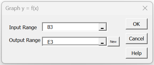
We next press the key sequence Ctl-m and choose the Graph y = f(x) data analysis tool from the list of options that appears on the Desc tab (or from the main menu if using the original user interface). Fill in the dialog box that appears as shown in Figure 1 and click on the OK button.
Figure 1 – Graph y = f(x) dialog box
Note that you only need to insert cell B3 (the upper left-hand corner of the 2 × 2 range) in the Input Range, although you can instead insert B3:C4.
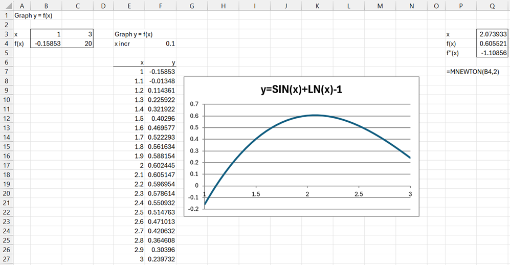
After clicking on the OK button, the output in Figure 2 appears.
Figure 2 – Graph of y = sin(x) + ln(x) – 1
We see that there is a local maximum near x = 2. We can use the worksheet formula =MNEWTON(B3,2) to better locate this maximum, choosing to use x = 2 as the initial guess. From the output in range Q3:Q5, we see that the local maximum occurs at x = 2.073933 where f(x) = .605521. Since the value in Q5 is negative, we know that this critical point is indeed a local maximum.
Extended Example
Example 2: Find all the local maxima and minima of y = sin(x) + ln(x) -1 in the interval [0, 10].
As we saw in Example 1, it is helpful to draw the graph to approximate where these critical values may lie. Using the Graph y = f(x) data analysis tool again with a slightly different input range, we obtain the results shown in Figure 3 (only the first 19 points are displayed from columns E and F).
Figure 3 – Graph of y = sin(x) + ln(x) – 1 in [.5, 10]
We see that the potential critical values are near x = 2, 4.5, and 8. Using MNEWTON once again, we see that there are local maxima at (2.0739, 0.6055) and (7.9796, 2.0690), and a local minimum at (4.4877, -0.4735).
Examples Workbook
Click here to download the Excel workbook with the examples described on this webpage.
Reference
Das, T. (2024) Five ways to make scatter plot in Excel
https://www.howtoexcel.org/make-scatter-plot/


![Graph y = f(x) over [0, 10]](https://real-statistics.com/wp-content/uploads/2024/09/extended-graph-yfx.png)