Basic Concepts
A surface chart is a 3-dimensional representation of data. Data is represented as a two-dimensional table, where the row headings represent the x-axis values, the column headings represent the y-axis values and the entries in the table represent the z-axis values. Excel’s support for such charts is quite basic and limited, but it can be useful. See Excel Charts for information about Excel’s charting capabilities.
We will use such charts to plot functions of the form z = f(x,y), as a three-dimensional counterpart to scatter plots for functions of the form y = f(x). We also show how to derive the table of data values for the function f(x,y) where we have the formula for this function.
Surface Chart Example
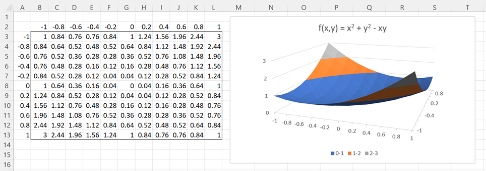
Example 1: Create a surface chart for the function f(x,y) = x2 + y2 – xy
On the left side of Figure 1, we build a table with values of f(x,y) based on x and y values between -1 and 1 in increments of .2.
Figure 1 – Scatter Chart
The x values are entered in the spreadsheet by inserting -1 in cell B2, the formula =B2+.2 in cell C2, and then highlighting the range C2:L2 and pressing Ctrl-R. The y values in column A can be inserted in the same way or by using the array formula =SEQUENCE(11,1,-1,0.2) or the Real Statistics counterpart =SEQ(11,1,-1,0.2), for users of Excel prior to Excel 2021.
The z = f(x,y) values are inserted by entering the formula =$A3^2+B$2^2-$A3*B$2 in cell B3, and then highlighting the range B3:L13 and pressing Ctrl-R and Ctrl-D.
To create the surface chart shown on the right side of Figure 1, we highlight the range A2:L13 and then select Insert > Charts|Surface.
Cautions
A few cautions need to be mentioned:
- When the row and/or column headings are numeric, Excel often assumes that this is data and so it creates its own labels for the x-axis and y-axis. This is not a problem when the values in the axis on the bottom of the chart are numeric, since they can be corrected using the Select Data Source option, but it can be a problem when the values in the axis on the right side of the chart are numeric. To avoid this problem, you could reformat the axes data as text (by highlighting the data and choosing the Text category from the Home > Number pull-down menu).
- When the number of x-axis entries is less than or equal to the number of y-axis entries then the chart will appear as displayed in Figure. When the number of y-axis entries is less than the number of x-axis entries, then the axes are interchanged on the chart. Excel prefers to place the shorter axis on the right side of the chart and not on the bottom.
Note that for Example 1, values on both axes are numeric, but despite this, the surface chart came out correctly. This won’t always be the case, and I haven’t yet discovered when this might happen.
Note too that for Example 1, the number of entries on the x-axis is the same as the number of entries on the y-axis, namely 11, and so the x-axis appears on the right side of the chart and the y-axis appears on the bottom of the chart.
Worksheet Function
To simplify the creation of the data that appears on the left side of Figure 1, Real Statistics provides the following worksheet function. This function takes a lambda function parameter, which is a parameter that is a function. Such functions are described in Real Statistics Lambda Capabilities and Lambda Functions using Cell Formulas.
Real Statistics Function: The Real Statistics Resource Pack provides the following array worksheet function.
FUNC2D(R1, xlo, xup, ylo, yup, xincr, yincr, prec, Rx, Ry): returns an array of the type shown on the left side of Figure 1 for the function f(x,y) expressed in cell R1 for x values in the range xlo to xup in increments of xincr and for y values in the range ylo to yup in increments of yincr.
Here, R1, Rx, and Ry are as for the FUNC2, DERIV, FMIN2 (see, for example, Global Max/Min of a Multivariate Function) and a variety of other Real Statistics worksheet functions. Namely, f(x,y) is expressed as a worksheet formula in cell R1. The variables x and y are represented by the addresses in Rx and Ry, respectively.
If the Rx argument is omitted, then x is represented by the first cell address in the formula in cell R1. If the Ry argument is omitted, then y is represented by the second cell address in the formula in cell R1.
prec is a small positive number (default 0.00000001). Any row or column heading value that is less than or equal to prec will be treated as zero. This improves the display of such values on the chart.
Example using FUNC2D
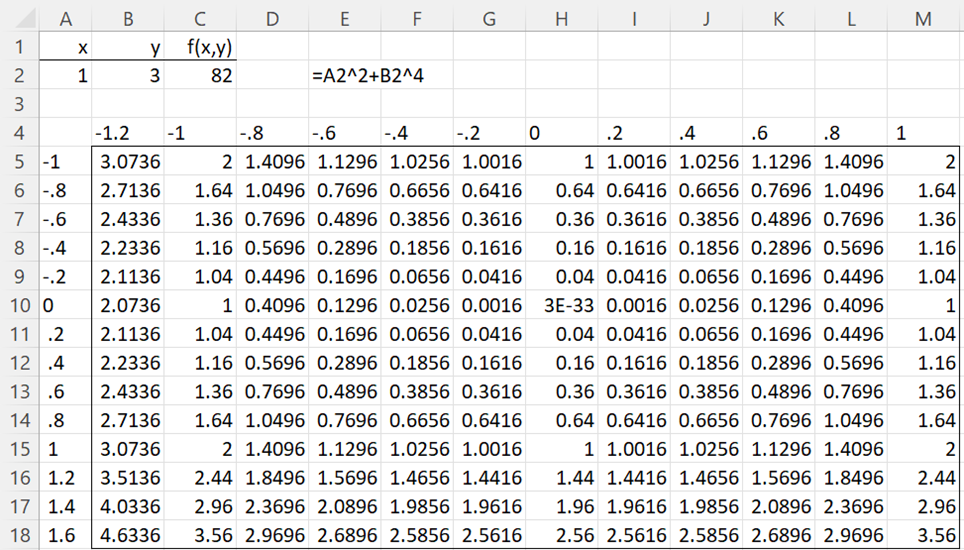
Example 2: Create a surface chart for the function f(x,y) = x2 + y4
This time we use x values between -1 and 1.6, and y values between -1.2 and 1, again in increments of .2. This is accomplished by using the array formula =FUNC2D(C2,-1,1.6,-1.2,1,0.2,0.2) in range A4:M18 of Figure 2.
Figure 2 – FUNC2D formula
The first argument in this formula is a reference to cell C2 which contains the formula =A2^2+B2^4. The x variable in the formula is A2, namely the first cell reference in the formula in C2 and the y variable is B2, namely the second cell reference in the formula in C2.
Note that the headings in row 4 and column A are left-justified. This is because they are formatted as text to avoid the problem identified above.
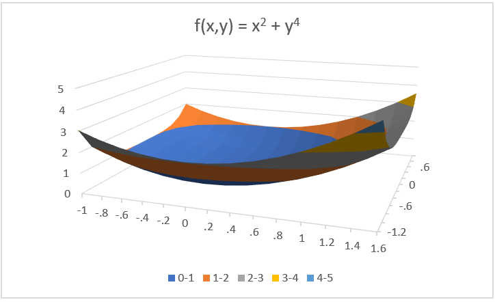
We next highlight the range A4:M16 and select Insert > Charts|Surface to obtain the chart shown in Figure 3.
Figure 3 – Surface Chart
Note that this time there are more entries on the x-axis (14) than on the y-axis (12), and so the x-axis is shown below the plot and the y-axis is shown to the right of the plot.
Examples Workbook
Click here to download the Excel workbook with the examples described on this webpage.
Links
References
Jeevan, A. Y. (2021) Surface chart in Excel. Wall Street Mojo
https://www.wallstreetmojo.com/surface-chart-in-excel/
Tutorials Point (2023) Excel chart – surface chart
https://www.tutorialspoint.com/excel_charts/excel_charts_surface.htm


