Objective
We describes how to use the Real Statistics Propensity Score Matching data analysis tool using an example.
See Real Statistics Support for PSM for a description of various Excel worksheet functions that are used by this data analysis tool.
Example
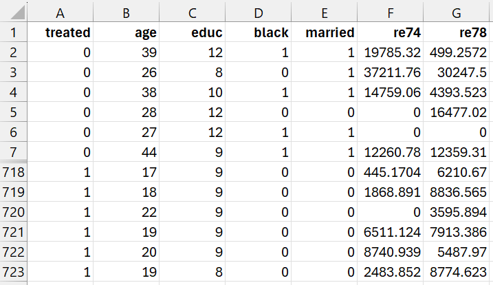
Example 1: The goal of the Lalonde study (1986) was to examine the effect of a job training program on real 1978 earnings. We will use the data shown in Figure 1 (a subset of the complete data). Here, only 12 rows of the data with 722 rows are displayed. 297 subjects received the job training (1 in column A) and 425 subjects did not receive the training (0 in column A). The data is arranged so that data for the control group precede those for the training group in Figure 1.
The subjects in this study were not randomly assigned to the treatment and control groups. Despite this, we want to use PSM to prune the data so that we can still determine how effective the treatment was in increasing 1978 revenues.
Here the data in columns B through F contain data for any confounding variables or variables that might be associated with whether a subject is in the treatment group or not. These variables are age, education (# of years in school), black (1 = black, 0 = not black), married (1 = married, 0 = not married), re74 (revenues in 1974). Finally, column G contains the outcome variable (revenues in 1978).
A link to the data set used is shown towards the end of this webpage.
Figure 1 – Lalonde study data
Accessing the data analysis tool
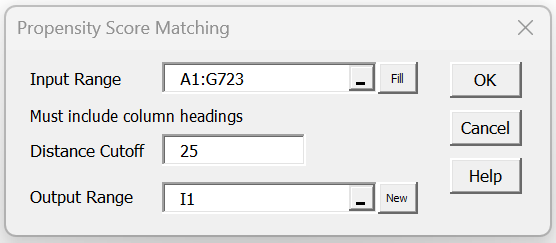
To conduct the analysis, press the Ctrl-m key combination to access the Real Statistics main menu. Next choose the Propensity Score Matching option from the Misc tab, and fill in the dialog box that appears as shown in Figure 2.
Figure 2 – PSM dialog box
Note that the cutoff is set to 25, which actually means 25/1000 = .025, Since the propensity score is a probability, it takes values between 0 and 1.0. As long as the distance between each treatment subject is no more than .025 units from some remaining control subject, then this subject (as well as the control subject the smallest distance away) will not be pruned from the final matched treatment group.
Propensity Scores
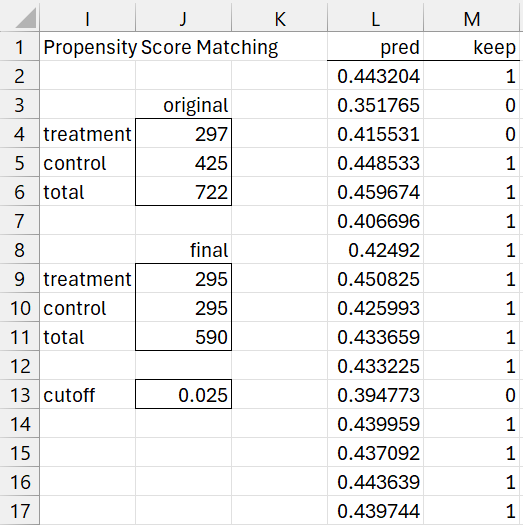
After clicking on the OK button on the dialog box, initially the results shown in Figure 3 appear (only the first 16 of 722 entries for columns L and M are displayed).
Figure 3 – PSM Output (part 1)
We see from range J4:J6 of Figure 3 that Figure 1 contains data for 297 subjects in the treatment group and 425 subjects in the control group, for a total of 722 subjects. The propensity scores for these subjects are displayed column L using the array formula
=LogitPred(B2:F723,MERGE(B2:F723,A2:A723),TRUE)
Matching
Column M contains the results of the nearest neighbor matching algorithm using the array formula
=PSM_Matching(L2:L723,J5+1,J13)
Entries in column M with a one signify that the corresponding subject is retained and entries with a zero are pruned. For example, the first control subject in Figure 1 has been matched with some treatment subject from Figure, while the second control subject has not been matched and so will be pruned.
We see from range J9:J11 that all but 2 (i.e. 297 – 295) of the original treatment subjects have been retained, but 130 (i.e 425 – 295) of the subjects from the control have been pruned.
The two pruned treatment subjects occur in rows 571 and 581 (the 35th and 45th subject in the original treatment group), with propensity scores respectively of .494265 and .506658. Note that the highest propensity score in the sample is for the treatment subject in row 581.
The highest two propensity scores for the control group are .490215 and .480203, either of which is within the cutoff of .025 from .506658. Since the treatment subject in row 581 is not retained, this means that these control subjects were already matched by the time the nearest neighbor algorithm tried to find a match for 45th treatment subject. The third highest propensity score for a subject in the control group is .473643, which is more than the cutoff distance for .506658, and so whether of not this control group subject was already matched it was too far away to serve as a match for .506658.
Pruning
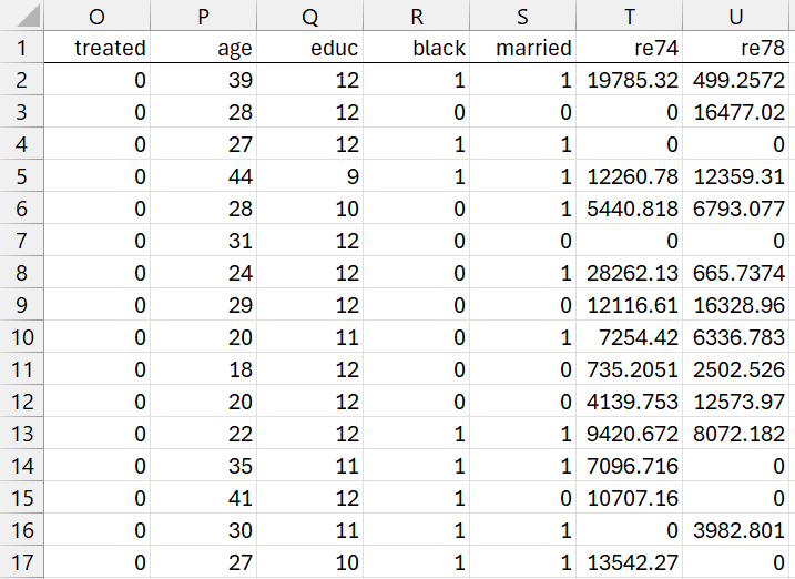
The PSM data analysis tool next prunes all the rows from Figure 1 that don’t have a corresponding entry of 1 in column M. This results in the output shown in Figure 4 (only the first 16 of 490 rows are displayed).
Figure 4 – PSM Output (part 2)
The output shown in range O2:U591 of Figure 4 is produced by using the array formula
=Pruning(A2:G723, M2:M723, FALSE)
If the PSM technique’s matching process is valid, then the data in Figure 4 can be used for further analysis comparing the the data in column U between the treatment and control groups.
Match Quality
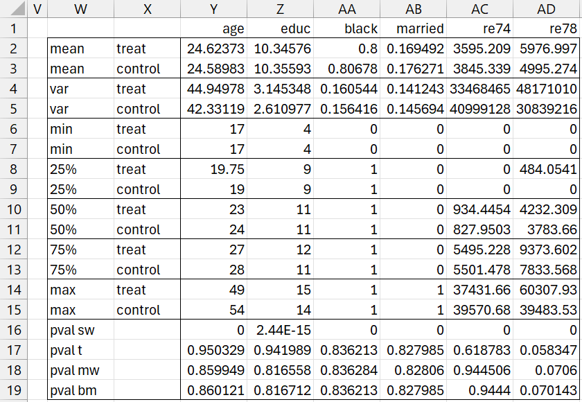
Finally, the PSM data analysis tool displays information in Figure 5 that helps you determine whether the matching process was successful.
Figure 5 – PSM Output (part 3)
We consider the matching to be successful if the data from confounding variables are well matched between the treatment and control groups. We compare the five confounding variables (age, education, black, married, and revenue 1974) based on the following statistics: mean, variance, min, 25th percentile, median (50th percentile), 75th percentile, and max.
As you can see in Figure 5, the mean age of subjects in the (pruned) treatment group is 24.62373, while the mean age for the control group is quite similar at 24.58983. The other statistics for age are also pretty similar, and the same is true for all the other confounding variables. Here, we ignore the quality of the matching for the outcome variable, namely re78.
Tests
The output shown in Figure 4 also displays the results for four different tests for each of the variables: Shapiro-Wilk test for normality, t-test, Mann-Whitney test, and Brunner-Munzel test.
For example, the p-value for the t-test comparing the age of subjects in the treatment group with those in the control group is p = .950329. This indicates that age is not significantly different between the two groups. The p-value that is reported is for the case where the variances don’t have to be equal (even though from cells Y4 and Y5 the variances are quite similar).
Since p-value = 0 for the Shapiro-Wilk test (cell Y16), the data does not appear to be normally distributed, and so the t-test is probably not the best way to compare the ages of the two groups. The PSM data analysis tool is essentially using the following formula to calculate the p-value for normality:
=SWTEST(Anova1ResX(P2:P296, P297:P591))
Since the normality assumption is violated, it is better to look at the Mann-Whitney test, for which is p-value = .859949 (cell Y18), which also tells us there isn’t a significant difference in the age of subjects between the treatment and control groups. If the variances weren’t so similar, we might have preferred to rely on the Brunner-Munzel test (cell Y19).
Caution
This approach is less applicable to the Black and Married variables since they only take values of 0 or 1.
Effectiveness of Training
Now that we have samples for the treatment and control groups with matching confounding variables, we need to address the quasi-experimental issue of the effectiveness of the job training. This is done in the usual way using a parametric approach (t-test or regression) or a non-parametric approach (Mann-Whitney or Brunnel-Munzel).
Actually, the last column in Figure 5 can be helpful. This column provides some information about the outcome variable, 1978 revenues. This time we don’t necessarily expect the treatment and control statistics to match, although they might (in support of the null hypothesis). We see from cells AD2 and AD3, that the treatment mean is 981.7223 higher than the control mean, Since the sample sizes are the same, the pooled variance is the average of the variances for the treatment and control groups, namely 39505113, and so the standard error is the square root, namely 6285.309. Hence, Cohen’s d is 981.7223/6285.309 = .156.
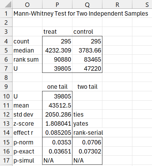
Since the residuals are not normally distributed (cell AD16) but the variances are pretty similar, we use the Mann-Whitney test to see that p-value = .0706, indicating that there isn’t a significant difference between the treatment and control groups.
We can use the T Test and Non-Parametric Equivalents data analysis tool to get more complete information, as shown in Figure 6.
Figure 6 – Mann-Whitney Test
Examples Workbook
Click here to download the Excel workbook with the examples described on this webpage.
Links
References
Garrido, M. M., Kelley, A. S., Paris, J., Roza, K., Meier, D. E., Morrison, R. S., and Aldridge, M. D. (2014) Methods for Constructing and Assessing Propensity Scores
https://pmc.ncbi.nlm.nih.gov/articles/PMC4213057/pdf/hesr0049-1701.pdf
Luvsandorj, Z. (2023) A Beginner’s Guide to Propensity Score Matching
https://builtin.com/data-science/propensity-score-matching
Wikipedia (2024) Propensity score matching
https://en.wikipedia.org/wiki/Propensity_score_matching
McKee, D. (2015) An intuitive introduction to propensity score matching
https://www.youtube.com/watch?v=ACVyPp1Fy6Y
