Objective
In Box Plots we show how to create box plots using the Box Plots option of the Real Statistics Descriptive Statistics and Normality data analysis tool. We now show how to create these box plots manually using Excel’s charting capabilities.
Basic Approach
Set-up
Example 1: Create the box plot for Example 1 of Box Plots using Excel’s charting capabilities.
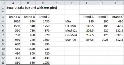
Figure 1 – Box Plot data
Select the range containing the data, including the headings (A3:C13). Now create the table in the range E3:H8. The output in column F corresponds to the raw data from column A. Column G corresponds to column B and column H corresponds to column C. In fact, once you construct the formulas for the range F4:F8, you can fill in the rest of the table by highlighting the range F4:H8 and pressing Ctrl-R.
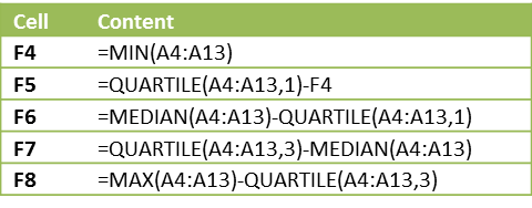
The formulas for the cells in the range F4:F8 are as follows:
Figure 2 – Box Plot table formulas
Procedure
Once you have constructed the table, you can create the corresponding box plot as follows:
- Select the data range E3:H7. Notice that the headings are included on the range, but not the last row.
- Select Insert > Charts|Column > Stacked Column
- Select Design > Data|Switch Row/Column if necessary so that the x-axis represents the brands
- Select the lowest data series in the chart (i.e. Min) and set fill to No fill (and if necessary set border color to No Line) to remove the lowest boxes. This is done by right-clicking on any of the three Min data series boxes in the chart and selecting Format Data Series… On the resulting dialog box, choose Fill|No fill.
- Repeat the previous steps for the lowest visible data series (i.e. Q1-Min); i.e. right-click on the Q1-Min data series and select Format Data Series… > Fill|No fill. Alternatively right-click on the Q1-Min data series and press Ctl-Y.
- With the Q1-Min data series still selected, choose Layout > Analysis|Error Bars > More Error Bar Options. On the resulting dialog box (Vertical Error Bars menu), click on the Minus and Percentage radio buttons and insert a percentage error of 100%.
- Click on the Q3-Med data series (the uppermost one) and choose Layout > Analysis|Error Bars > More Error Bar Options. On the resulting dialog box (Vertical Error Bars menu), click on the Plus and Custom radio buttons and then click on the Specify Value button. Now specify the range F8:H8, i.e. the last row of the table you created above, in the dialog box that appears (in the Positive Error Values field).
- Remove the legend by selecting Layout > Labels|Legend > None.
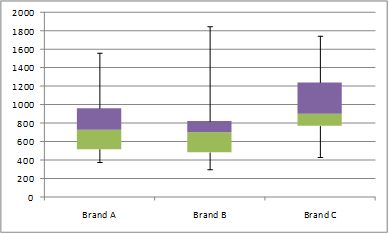
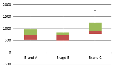
The resulting box plot is
Figure 3 – Box Plot
Approach with Negative Data
The approach described above works perfectly for non-negative data. When a data set has a negative value, the y-axis will be shifted upward by –MIN(R1) where R1 is the data range containing the data. Thus if R1 ranges from -10 to 20, the range in the chart will range from 0 to 30. This is true of the manual approach described above as well as for the box plot produced by the data analysis tool in the Real Statistics Resource Pack. We now show how to manually produce the box plot when one or more data elements are negative.
Example
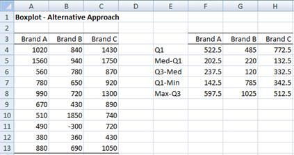
Example 2: Create the box plot for the data in Figure 4 using Excel’s charting capabilities.
Figure 4 contains the same data as in Figure 1 except that we have changed the value in cell B11 to make it negative.
Figure 4 – Box plot for negative data
Procedure
From the data we construct the modified table in range E3:H8 as above and then carry out the following steps to create the chart:
- Select the data range E3:H6. Notice that the headings are included on the range, but not the last two rows.
- Select Insert > Charts|Column > Stacked Column
- Select Design > Data|Switch Row/Column if necessary so that axis represents the brands
- Select the lowest data series in the chart (i.e. Q1) and set fill to No fill (and if necessary set border color to No Line) to remove the lowest boxes. This is done by right-clicking on any of the three Q1 data series boxes in the chart and selecting Format Data Series… On the resulting dialog box, choose Fill|No fill.
- With the Q1 data series still selected, choose Layout > Analysis|Error Bars > More Error Bar Options. On the resulting dialog box (Vertical Error Bars menu), click on the Minus and Custom radio buttons and then click on the Specify Value button. Now specify the range F7:H7, i.e. the second to last row of the table you created above, in the dialog box that appears (in the Minus Error Values field).
- Click on the Q3-Med data series (the uppermost one) and choose Layout > Analysis|Error Bars > More Error Bar Options. On the resulting dialog box (Vertical Error Bars menu), click on the Plus and Custom radio buttons and then click on the Specify Value button. Now specify the range F8:H8, i.e. the last row of the table you created above, in the dialog box that appears (in the Positive Error Values field).
- Remove the legend by selecting Layout > Labels|Legend > None.
The resulting chart is as follows:
Figure 5 – Box Plot: an alternative approach
Observation
Unfortunately, the data analysis tool in the Real Statistics Resource Pack cannot produce this box plot automatically. When negative data are present there are two choices:
- Produce the box plot manually as described in Example 2
- Use the Box Plot option of the Real Statistics Descriptive Statistics and Normality data analysis tool (as described in Box Plots) and either accept that the y-axis will be displaced upwards or simply remove the labels on the y-axis by right-clicking on the labels in the y-axis and selecting Delete (or by pressing the Backspace key)
Examples Workbook
Click here to download the Excel workbook with the examples described on this webpage.
References
Peltier, J. (2011) Excel box and whisker diagram (box plots)
https://peltiertech.com/excel-box-and-whisker-diagrams-box-plots/
Microsoft (2013) Create a box plot
https://support.microsoft.com/en-us/office/create-a-box-plot-10204530-8cdf-40fe-a711-2eb9785e510f
I’ve found a problem with the negative data in example 2.
I think this example works when the min. value is negative as the error bar will gladly extend below 0. However, the if Q1 is negative, the series will start at 0.
Using example 2 on my data (below):
The negative error bar would begin at the min. value (-57) then form a gap between -45 and 0.
The series for Q1 would begin at 0 rather than -41
I am yet to find a solution.
data
min: -57
Q1: -41
med: -35
Q3: -20
max: 18
Q1: -41
med-Q1: 6
Q3-med: 16
Q1-min: 15
max-Q3: 38
Tom,
I have used the Real Statistics data analysis tool where all the data elements are negative, and it works fine.
Can you give me a set of data for which the problem that you have identified occurs? Here I am asking for the value of the data elements and not min, Q1, med, etc.
Charles
thank you so much! this post is really brilliant!
Could I also ask, if there are ways to include the outliers?
See https://www.real-statistics.com/excel-capabilities/creating-box-plot-outliers-manually/
Charles
Charles!
Thank you from Spain. It worked perfectly on my excel 2011 Mac version. It has also saved my paper! So clear and so usefull! after an hour searching in google I found this treasure. Glad you share your knowledge.
So great!
Also perfect for aggregate data like mine.
Glad I could help.
Charles
Many thanks, very clear and useful. It save my paper :)))))))))
Glad I could help.
Charles
Very clear and extremely useful. This suggestion will save my thesis work
Hi – I have a data set where not all the items should have equal weight. Each item in the list has a probability attached to it, and the probabilities all add up to 100%. Is there a way I can produce a box plot that takes account of the probability, i.e. it does not simply treat each item as being equally weighted?
Thanks
Donny,
A box plot is related to a data set. One approach is to multiply the probability weights by some larger number, say 100. This makes your data into a frequency table. You can now create the box plot for the frequency table.
For example, suppose you have 3 data elements: 5, 7, 13 with probability weights 20%, 30%, 50%. Multiplying these weights by say 10 yields frequencies of 2, 3 and 5. Thus you can use a box plot for the data set: 5,5,7,7,7,13,13,13,13,13. The Real Statistics function FREQ2RAW can be helpful in implementing this.
Charles
Hi,
I know this is an old post – however, it has been very useful in helping me create boxplots for my study, so thank you!
Although, some of my data I am having the same issue as some people have posted in the past, I have a mixture of positive and negative data and on some of my boxplots the bottom whiskers do not meet the bottom of the box?
Would you be able to help me with this?
I produced a very professional box plot, thanks to you!
Glad I could help.
Charles
Hi Charles,
Don’t know if this thread is still active. I am having issues with the bottom whiskers with data that is all negative as below .
-0.780 Min -0.780
-0.774 Q1 -0.755039191
-0.755 Median -0.734
-0.748 Q3 -0.699078185
-0.734 Maximum -0.694
-0.724
-0.699
-0.699 Q1 -0.755
-0.694 Med -Q1 0.021
Q3-Med 0.035
Q1-Min 0.024
Max-Q3 0.005
Any suggestions, I have tinkered around with the data but to no avail
Sorry that is as follows
-0.780
-0.774
-0.755
-0.748
-0.734
-0.724
-0.699
-0.699
-0.694
Q1 -0.755
Med -Q1 0.021
Q3-Med 0.035
Q1-Min 0.024
Max-Q3 0.005
Hi Maggie,
Are these 9 elements all your data?
Charles
Hello Maggie,
If you send me an Excel file with your data and the results you got, I will try to figure out what is happening.
Charles
I made my box plot using the directions above for negative data but when I put my error bars in one of the ‘minus’ error bars doesn’t connect to the boxes. Would you know how to fix this?
Ali,
If you send me an Excel file with your data and box plot results, I will try to see why this is happening.
Charles
I am getting the same issue. How did you solve this problem?
Blaine,
Which problem are you referring to?
Charles
I followed the instructions but the bottom line does not conect to the other bars. Q1 custom errors line with the Q1-Min data as the negative error.
I see this is a repeated roblem as at least two users have had it.
Was the issue located?
Are you using the data in either Example 1 or 2? If you are using data with negative values then please look at the observation before Example 2. If you like you can send me an Excel file with your data and the Box Plot that you got. I will be happy to try and figure out what has gone wrong and how to correct it.
Charles
Is there any way to add a box and whisker chart to an Excel spreadsheet using Visual Studio? I have not been able to find any help on the topic using C#.
Michael,
Probably yes, but I am not using Visual Studio or C# at present.
Charles
The only posts I have found are third party software solutions that cost money. Thanks anyway.
I made my boxplot using the directions above for negative data but when I put my error bars in one of the ‘minus’ error bars doesn’t connect to the boxes. Would you know how to fix this?
Sofia,
I would have to see what you have done in order to figure out what has gone wrong and what to do about it.
Charles
As a workaround to the problem with negative values in the source data, would it be possible in your tool to create an automatically scaled artificial Y axis (covering the positive and negative range) using extremes from the calculated data, then put the boxplots and means on the secondary axis with a suitably scaled range but with the values hidden?
Bob,
In the past, I tried to find a way to do this but was not successful.
I see that you have sent me an email with suggestions as to how to do this. I haven’t read your email yet, but will do so shortly since this approach sounds very interesting. Thank you for sending this to me.
Charles
I think you need to change it to Min-Q1 (not Q1 – min) when you have lots of negative data (e.g. negative median, negative minimum and negative Q1)
Kirk,
I just tried that, but it doesn’t seem to work. I like the idea, but I have been able to make it work.
Can you send me an example where you have made the modification(s) that you are suggesting? You can find my email address at Contact Us.
Charles
Hi Charles,
Thank you for your tutorial. I have just tried creating a boxplot for a dataset containing both negative and positive values. Will it only work when there is only a single negative value in the dataset? Or will it not work when Q1 is negative?
My dataset is as follows:
Group 1: -0.22, 0.81, 1.02, 0.89, -0.44
Group 2: 1.09, 1.07, 0.81, 1.58, 0.55, -0.31
For Group 1:
Q1 -0.22
Med-Q1 1.03
Q3-Med 0.08
Q1-Min 0.22
Max-Q3 0.13
For Group 2:
Q1 0.62
Med-Q1 0.32
Q3-Med 0.15
Q1-Min 0.93
Max-Q3 0.50
My boxplot for Group 1 is off; the median (where the Med-Q1 and Q3-Med boxes meet) is higher than it should be, and the bottom error bar does not reach the Med-Q1 box (starts from the bottom of the Q1 box rather than the top like the other error bars).
Thoughts?
Thanks
Catherine,
Are you using the Real Statistics data analysis tool to create the box plot or are you doing it manually?
I just used the Real Statistics data analysis tool for Group 1 and found that it works correctly even with two negative values. The chart is simply raised by .44 (i.e. the negative of the lowest negative value).
If you created the chart manually, then you need to fix how you created the table. The first value is not Q1, but Q1-Min, and this has value +.22.
Charles
Hi Charles,
I am trying to create a boxplot with data that contains negative values. I am confused about the order the table before plotting. In the tutorial you have Q1, Med-Q1, Q3-Med, Q1-Min, and Max-Q3. In your response to Catherine you state that if the table is done manually it will be Q1-Min for the first value. I want to double check the order of the table to check if I am plotting correctly. I am plotting this manually.
Thank you ,
Vicky
Vicky,
The order is
Min
Q1-Min
Med-Q1
Q3-Med
Max-Q3
Charles
Dear Charles
Thank you; I have been struggling to produce boxplots when there is negative data present, so your 2nd exercise here is very promising. I have not yet succeeded completely so I will try a few more permutations along the lines you provide.
In step 1, you write: “1.Select the data range E3:H7. Notice that the headings are included on the range, but not the last two rows”. However E3:H7 omits only the last row, not the last two rows. Which is correct?
Many thanks, Rowan
Got it! It is indeed the last two rows that need to be omitted in the original data selection; makes sense since those two are both used in specifying custom values for the error bars. So, there’s just a minor typo in instruction 1 applying to negative data. In your example it is E3:H6 rather than E3:H7 that should be selected.
A tip for other readers: since the fractionally more complex process needed when there is negative data also works perfectly for data that is all positive, I recommend building your spreadhseet to cope with negative data in the first place.
Many thanks again Charles,
Rowan
Rowan,
Thanks for catching this error. I have just corrected the error on the webpage.
I really appreciated your help in improving the quality of the website.
Charles
Hi,
I want to compare two groups over time (t0,t1,t2,t3) in a graph. Is it possible to group the boxplots of both groups together per timepoint? So, on the x-axis the timepoints and per timepoint 2 boxplots (for each group)?
Hope you can help!
Thanks a lot
Josien,
Yes. Put the data in 8 columns. Use the headings t0A, t0B, t1A, t1B, t2A, t2B, t3A, t3B (or something similar) as the column headings.
Charles
Amazing…..
I want the guidance to prepare the comparative boxplot for various 3 treatment on pain scale. we wish to show effect on pain scale before and after Rx1, before and after Rx2 and Before and After Rx3. How to plot in excel?
thank you very much I enjoy of this site
Thank you very much for your nice guidance. I have tried it, and it work.
ok, got it. thank you very much
i am trying to create the Chart of standard error of the means using excel 2013 and finding difficult to follow the following steps
Highlight the sample means (range B19:E19 of Figure 6) and then select Insert > Charts|Line and choose the Line with Markers option.
Under Chart Tools select Layout > Analysis|Error Bars and then More Error Bar Options > Vertical Error Bars
Now select Both, Cap and Custom radio buttons, and click Specify Value
On the dialog box that is displayed enter the range where the standard error is stored (B21:E21 in Figure 6) in both of the boxes that are displayed, and then click OK and then Close.
please help.