Basic Concepts
The procedure for manually creating a box plot with outliers (see Box Plots with Outliers) is similar to that described in Special Charting Capabilities. One key difference is that instead of ending the top whisker at the maximum data value, it ends at the largest data value less than or equal to Q3 + 1.5*IQR. Similarly, the bottom whisker ends at the smallest data value greater than or equal to Q1 – 1.5*IQR. The other difference is that we need to manually add a small circle or each data value greater than Q3 + 1.5*IQR or less than Q1 – 1.5*IQR. We also add an × at the mean data value.
Examples
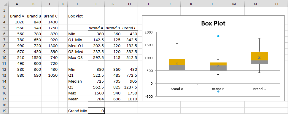
Example 1: Repeat Example 2 of Special Charting Capabilities, showing outliers.
The result is shown in Figure 1. We now show how to construct this output manually using standard Excel capabilities.
Figure 1 – Box Plots with Outliers
To create this box plot manually, you need to first create the values in range F12:F17. The Q1, Median, Q3 and Mean values for Brand A in the range F12:F17 are calculated by the formulas =QUARTILE(A4:A13,1), =MEDIAN(A4,A13), =QUARTILE(A4:A13,3) and =AVERAGE(A4:A13). We use the following array formulas to calculate the values for Lower (i.e. lower whisker) and Upper (i.e. upper whisker) for Brand A.
=MIN(IF(A4:A13>=F12-1.5*(F14-F12),A4:A13,””))
=MAX(IF(A4:A13<=F14+1.5*(F14-F12),A4:A13,””))
Keep in mind that these are array formulas and so you need to press Ctrl-Shft-Enter and not just Enter.
Once you have entered all these formulas, highlight the range F12:H17 and press Ctrl-R. Next, place the formula =F12 in cell F6, highlight range F6:H6 and press Ctrl-R. Finally place the formula =MAX(F13-F12,0) in cell F7, highlight the range F7:H10 and press the key sequences Ctrl-R and Ctrl-D. This fills in all the values in the range F6:H10.
You now follow the same steps as used in Example 1 or 2 of Special Charting Capabilities, substituting Lower and Upper for Min and Max. The result will be as shown in Figure 1, except that the o and × symbols won’t yet be displayed for outliers and the mean values. We now show how to add each of these individually.
Adding Markers for the Means
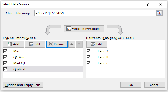
We start by adding the means for each of the brands. Click on the chart in Figure 1 and select Chart Tools|Design > Data|Select Data. This will bring up the dialog box shown in Figure 2.
Figure 2 – Select Data Source
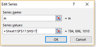
Click on the Add button (on the left side of the dialog box). Fill in the dialog box that appears as shown in Figure 3.
Figure 3 – Add new series for the means
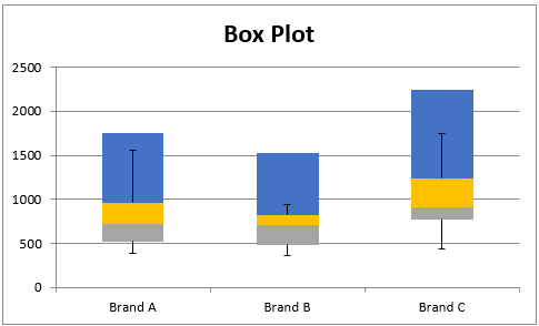
When you press the OK button, the chart changes to that shown in Figure 4.
Figure 4 – Modified chart
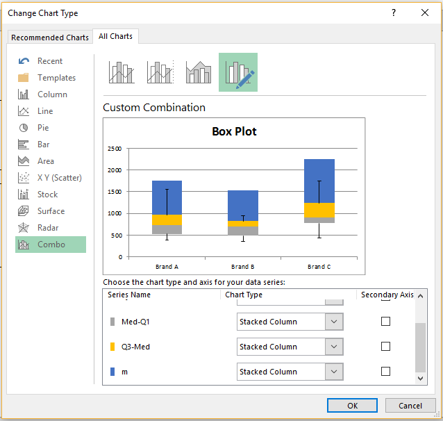
We get this result because Excel interprets the added means as stacked bar charts. Thus, we need to tell Excel that this added series should be interpreted instead as a scatter plot. We do this by first clicking on the OK button of the Select Data Source dialog box (see Figure 2) that reappears to close this dialog box, and then right-clicking on any of the blue bars shown in Figure 4. Next, we select Change Series Chart Type … from the menu that appears. The dialog box shown in Figure 5 will now appear.
Figure 5 – Change Chart Type dialog box
As we can see from Figure 5, the means are treated as a Stacked Column. Now click on the dropdown menu for m (headed by Stacked Column) and select the first Scatter Plot option. Then press the OK button on the Change Chart Type dialog box.
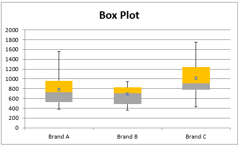
The chart changes to the more acceptable format shown in Figure 6.
Figure 6 – Box Plot after adding brand means
Identifying Outliers
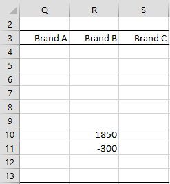
We now proceed to add the outliers to the chart, but first, we need to identify the outliers. One approach for doing this is shown in Figure 7.
Figure 7 – Identifying outliers
We place the formula =IF(A4>F$15,A4,IF(A4<F$11,A4,””)) in cell Q4, highlight the range Q4:S13 and press Ctrl-R and Ctrl-D. There are only two outliers, namely -300 and 1850 for Brand B.
Adding Markers for Outliers
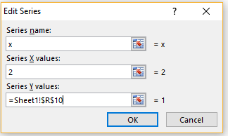
We now proceed to add these two outliers to the chart, one by one, using a procedure similar to that used to add the mean values. To add 1850, click on the chart in Figure 6 and select Chart Tools|Design > Data|Select Data. This will bring up the dialog box shown in Figure 2. Once again, click on the Add button. Fill in the dialog box that appears as shown in Figure 8.
Figure 8 – Add new series for one outlier
Note that this time the default chart is a scatter chart (the last chart type selected) and so we are prompted for both X and Y values (unlike the prompt in Figure 3). Since the outlier 1850 (shown in cell R10 of Figure 7) is in Brand B, we must insert 2 in the Series X values field.
We add the outlier -300 in a similar fashion. The result is shown in Figure 9.
Figure 9 – Box Plot with Outliers
Changing the Outlier Markers
The last step is to change the marker symbol used to indicate the outliers. We show how to do this in Excel 2013 and later versions. The approach is similar in earlier versions of Excel.
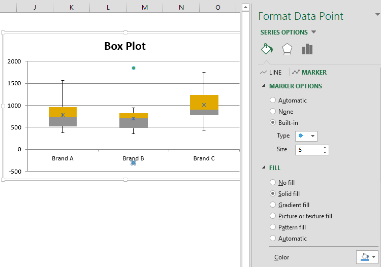
Click on one of the outlier marker symbols and then select Chart Tools|Format > Current Selection|Format Selection. Click on the Fill & Line icon and then select the Marker option. See Figure 10. Next, click on Built-in from the Marker Options and choose the Type that you like. You can also choose the Color (lower right-hand corner of Figure 10).
Figure 10 – Changing the Marker Type
Now repeat the above steps for the other outlier.
When Negative Data is Not a Problem
Note that despite the fact that there is a negative value, namely the outlier -300 for Brand B (cell B11 of Figure 1), no adjustment for the negative value is necessary when using the Box Plot with Outliers option of the Real Statistics Descriptive Statistics and Normality data analysis tool. The reason for this is that none of the lower whiskers go into negative territory.
This can be seen from cell F18 which contains the formula =MIN(0,F11:H11). As long as this value is zero and not negative, then no adjustment is necessary.
Handling Negative Data
Example 2: Use the Box Plot with Outliers option of the Real Statistics Descriptive Statistics and Normality data analysis tool to create the box plots for the data in range A6:A16 of Figure 11.
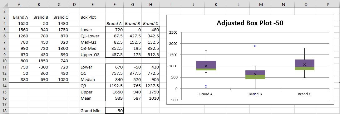
If we repeat all the steps described for Example 1, this time we see that the lower whisker for Brand B does go into negative territory. This is evident from the fact that cell F18 of Figure 11 contains the negative value -50.
Despite this, no change is required to the manual procedure described for Example 1. When we use the Real Statistics Descriptive Statistics and Normality data analysis tool, the data analysis tool makes an adjustment to handle the negative value in cell F18 of Figure 11.
Figure 11 – Box Plot with Outliers, negative adjustment
The main change that the Real Statistics data analysis tool makes when implementing the procedure described for Example 1 is to use the following formula in cell F5, =F11-$F18. Upon highlighting range F5:H5 and pressing Ctrl-R, a similar adjustment will be made to the Lower values for all three brands.
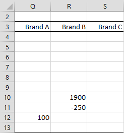
The data analysis tool also adjusts the mean and outlier values by –F18, i.e. by adding 50. E.g. Figure 12 shows how to identify the values to use for outliers. This is done by inserting the formula =IF(A4>F$15,A4-$F$18,IF(A4<F$11,A4-$F$18,””)) in cell R7, highlighting the range Q4:S13 and pressing Ctrl-R and Ctrl-D.
Figure 12 – Negative adjustment for outliers
This produces the three outliers, 50 for Brand A and 1850 and -300 for Brand B, each augmented by 50.
Examples Workbook
Click here to download the Excel workbook with the examples described on this webpage.
References
Microsoft (2016) Create a box and whiskers chart
https://support.microsoft.com/en-us/office/create-a-box-and-whisker-chart-62f4219f-db4b-4754-aca8-4743f6190f0d
Peltier, J. (2011) Excel box and whisker diagram (box plots)
https://peltiertech.com/excel-box-and-whisker-diagrams-box-plots/

Hello Charles,
Please, Real-Statistics-Examples-Basics.xlsx
This demo e-file
Box Plot 4 in this tab
Is it possible to automate the output of outliers worth charting?
Or do you need to do it manually?
Because there are quite a lot of outliers, it takes a lot of time to manually make them one by one.
thanks for your reply
Happy new year and good health
There are two vertical axes on my box plots. One is the data, but what is the other one for? Can I remove it so that the box plots look like your examples?
Mark,
In the case where there are negative data items, the approach used to create the box plot required that the data be transformed by the addition of some constant value to remove the effects of the negative data. Two vertical axes are used: one based on the original data and the other based on the transformed data. You may remove one of these axes.
Charles
What are the steps for plotting data with both positive and negative items
Hello Herb,
This webpage describes how to create a Box Plot with both positive and negative items.
You have two choices: use the approach described on this webpage or if you have Excel 2016 or later you can use the Excel’s built-in Box Plot tool.
Charles